BCOG-171 Solved Assignment 2025
Section-A
(Attempt all the questions. Each question carries 10 marks.)
Question:-1
Explain the concept of a Production Possibility Curve. Enumerate its assumptions. Illustrate it with the help of an example.
Answer:
1. Understanding the Production Possibility Curve
The Production Possibility Curve (PPC), also known as the Production Possibility Frontier (PPF), is a fundamental economic model that illustrates the maximum feasible combinations of two goods or services an economy can produce given its resources and technology, assuming full and efficient utilization. The curve graphically represents trade-offs, opportunity costs, and scarcity—core tenets of economics. By plotting all possible output combinations, the PPC demonstrates the limits of production and the sacrifices required when reallocating resources from one good to another.
2. Key Assumptions of the Production Possibility Curve
The PPC is built on several simplifying assumptions to maintain clarity and focus on its core principles:
- Fixed Resources: The economy has a finite amount of labor, capital, land, and other inputs.
- Constant Technology: Technological advancements or regressions do not occur during the period under analysis.
- Full Efficiency: All resources are utilized optimally, with no waste or unemployment.
- Two-Good Economy: The model assumes only two goods are produced, simplifying the analysis of trade-offs.
- Divisible Resources: Factors of production can be smoothly reallocated between the two goods without friction.
These assumptions create an idealized framework, allowing economists to isolate the effects of resource allocation and opportunity costs.
3. Illustrating the Production Possibility Curve with an Example
Consider an economy that produces only two goods: wheat (a staple crop) and cars (a manufactured good). The PPC might depict the following production combinations:
- Point A: 10,000 tons of wheat and 0 cars.
- Point B: 8,000 tons of wheat and 1,000 cars.
- Point C: 5,000 tons of wheat and 2,000 cars.
- Point D: 0 tons of wheat and 3,000 cars.
The curve connecting these points is concave (bowed outward), reflecting increasing opportunity costs. As the economy shifts resources from wheat to car production, each additional car requires sacrificing larger quantities of wheat. This shape arises because resources are not perfectly adaptable to both industries—some land and labor are better suited for farming, while others are more efficient in manufacturing.
Points inside the curve (e.g., 4,000 tons of wheat and 1,000 cars) indicate inefficiency, such as unemployment or misallocation. Points outside the curve are unattainable with current resources and technology, though economic growth (via increased resources or improved technology) could shift the PPC outward over time.
Conclusion
The Production Possibility Curve serves as a powerful tool for visualizing economic constraints and trade-offs. By adhering to its core assumptions, the model clarifies the concept of opportunity cost and the necessity of choice in resource allocation. Real-world applications, such as the wheat-and-cars example, demonstrate how societies must prioritize production to maximize welfare under scarcity. While simplified, the PPC provides a foundational understanding of economic efficiency, growth potential, and the inherent limitations faced by all economies.
Question:-2
Explain the law of demand with the help of a demand schedule and a demand curve. Also explain its exception using the distinction between substitution and income effects.
Answer:
1. The Law of Demand: Definition and Core Principle
The law of demand is a foundational concept in economics stating that, all else being equal, the quantity demanded of a good or service decreases as its price increases, and vice versa. This inverse relationship arises from consumer behavior—when prices rise, purchasing power diminishes, leading buyers to seek alternatives or reduce consumption. Conversely, lower prices make goods more attractive, boosting demand. The law assumes that other factors influencing demand, such as income, tastes, and prices of related goods, remain constant.
2. Demand Schedule and Demand Curve
A demand schedule is a tabular representation of the relationship between price and quantity demanded. For example, consider the demand for apples:
| Price per Apple ($) | Quantity Demanded (per week) |
|---|---|
| 1.00 | 100 |
| 1.50 | 80 |
| 2.00 | 60 |
| 2.50 | 40 |
| 3.00 | 20 |
As the price rises from $1.00 to $3.00, the quantity demanded falls from 100 to 20 apples, illustrating the law of demand.
The demand curve translates this schedule into a graphical format, with price on the vertical axis and quantity on the horizontal axis. Plotting the above data yields a downward-sloping curve, visually reinforcing the inverse price-quantity relationship. The slope reflects consumers’ willingness to buy more at lower prices, capturing the essence of the law.
3. Exceptions to the Law of Demand: Substitution vs. Income Effects
While the law of demand generally holds, exceptions arise due to the interplay of substitution effects and income effects:
- Substitution Effect: When the price of a good rises, consumers switch to cheaper alternatives (e.g., opting for oranges if apples become expensive). This reinforces the law of demand.
- Income Effect: A price change alters purchasing power. For normal goods, higher prices reduce real income, further decreasing demand. However, for Giffen goods (a rare exception), the income effect dominates.
Giffen Goods Exception:
Inferior goods like staple foods (e.g., rice in low-income regions) may defy the law if price increases leave consumers too poor to afford substitutes. For instance, if rice prices rise, households might cut back on more expensive proteins and buy even more rice despite the cost, prioritizing basic sustenance. Here, the income effect outweighs the substitution effect, creating an upward-sloping demand curve segment.
Inferior goods like staple foods (e.g., rice in low-income regions) may defy the law if price increases leave consumers too poor to afford substitutes. For instance, if rice prices rise, households might cut back on more expensive proteins and buy even more rice despite the cost, prioritizing basic sustenance. Here, the income effect outweighs the substitution effect, creating an upward-sloping demand curve segment.
Veblen Goods Exception:
Luxury items (e.g., designer handbags) may see higher demand as prices rise because their perceived prestige increases. Consumers associate expensive prices with exclusivity, making these goods desirable beyond practical utility.
Luxury items (e.g., designer handbags) may see higher demand as prices rise because their perceived prestige increases. Consumers associate expensive prices with exclusivity, making these goods desirable beyond practical utility.
Conclusion
The law of demand elegantly captures typical consumer behavior through downward-sloping demand curves and schedules. However, exceptions like Giffen and Veblen goods reveal nuanced scenarios where psychological or economic constraints override standard patterns. Understanding the distinction between substitution and income effects is crucial for explaining these anomalies, demonstrating that demand dynamics extend beyond simple price-quantity relationships in real-world markets.
Question:-3
Distinguish between Perfectly Elastic, Perfectly Inelastic, Unit Elastic, Inelastic and Elastic supply curves with the help of diagrams.
Answer:
Distinguishing Between Perfectly Elastic, Perfectly Inelastic, Unit Elastic, Inelastic, and Elastic Supply Curves
The concept of supply elasticity measures how responsive the quantity supplied of a good or service is to a change in its price. Supply elasticity varies across different scenarios, resulting in distinct supply curve shapes. This essay explores perfectly elastic, perfectly inelastic, unit elastic, inelastic, and elastic supply curves, illustrating their characteristics with conceptual diagrams.
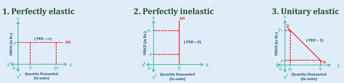
1. Perfectly Elastic Supply Curve
A perfectly elastic supply curve represents a scenario where suppliers are willing to provide any quantity of a good at a specific price, but none at a lower price. This curve is horizontal, indicating infinite elasticity. At the given price, quantity supplied can range from zero to infinity, but any price reduction leads to zero supply. This situation often arises in highly competitive markets with identical products, where suppliers can instantly adjust output without cost changes. For instance, in a market where goods are produced at a fixed cost with no capacity constraints, the supply curve remains flat at that cost level.
A perfectly elastic supply curve represents a scenario where suppliers are willing to provide any quantity of a good at a specific price, but none at a lower price. This curve is horizontal, indicating infinite elasticity. At the given price, quantity supplied can range from zero to infinity, but any price reduction leads to zero supply. This situation often arises in highly competitive markets with identical products, where suppliers can instantly adjust output without cost changes. For instance, in a market where goods are produced at a fixed cost with no capacity constraints, the supply curve remains flat at that cost level.
2. Perfectly Inelastic Supply Curve
In contrast, a perfectly inelastic supply curve is vertical, reflecting zero elasticity. Here, the quantity supplied remains constant regardless of price changes. This occurs when resources are fixed and cannot be increased, such as with unique assets like rare artwork or land in a specific location. No matter how high or low the price, the quantity supplied does not change. For example, the supply of a one-of-a-kind painting is fixed at one unit, making its supply curve perfectly vertical.
In contrast, a perfectly inelastic supply curve is vertical, reflecting zero elasticity. Here, the quantity supplied remains constant regardless of price changes. This occurs when resources are fixed and cannot be increased, such as with unique assets like rare artwork or land in a specific location. No matter how high or low the price, the quantity supplied does not change. For example, the supply of a one-of-a-kind painting is fixed at one unit, making its supply curve perfectly vertical.
3. Unit Elastic Supply Curve
A unit elastic supply curve indicates that a percentage change in price leads to an equal percentage change in quantity supplied, resulting in an elasticity of one. Graphically, this curve passes through the origin and is often a straight line with a specific slope, though its exact shape depends on the scale. In practical terms, this balance occurs in industries where production costs increase proportionally with output, such as in certain manufacturing sectors with scalable inputs.
A unit elastic supply curve indicates that a percentage change in price leads to an equal percentage change in quantity supplied, resulting in an elasticity of one. Graphically, this curve passes through the origin and is often a straight line with a specific slope, though its exact shape depends on the scale. In practical terms, this balance occurs in industries where production costs increase proportionally with output, such as in certain manufacturing sectors with scalable inputs.
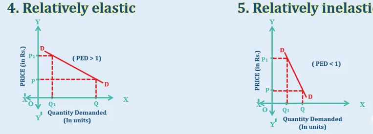
4. Inelastic Supply Curve
An inelastic supply curve is relatively steep, showing that quantity supplied changes by a smaller percentage than the price. Elasticity here is less than one. This is common for goods with limited production capacity or high adjustment costs, such as agricultural products in the short run, where land and time constraints restrict rapid increases in output. A steep curve reflects suppliers’ limited ability to respond to price changes quickly.
An inelastic supply curve is relatively steep, showing that quantity supplied changes by a smaller percentage than the price. Elasticity here is less than one. This is common for goods with limited production capacity or high adjustment costs, such as agricultural products in the short run, where land and time constraints restrict rapid increases in output. A steep curve reflects suppliers’ limited ability to respond to price changes quickly.
5. Elastic Supply Curve
An elastic supply curve is relatively flat, indicating that quantity supplied changes by a larger percentage than the price, with elasticity greater than one. This occurs in industries with flexible production processes, such as consumer electronics, where manufacturers can quickly ramp up output in response to price increases. The flatter slope shows significant responsiveness to price changes.
An elastic supply curve is relatively flat, indicating that quantity supplied changes by a larger percentage than the price, with elasticity greater than one. This occurs in industries with flexible production processes, such as consumer electronics, where manufacturers can quickly ramp up output in response to price increases. The flatter slope shows significant responsiveness to price changes.
Conclusion
The distinctions between perfectly elastic, perfectly inelastic, unit elastic, inelastic, and elastic supply curves highlight the varying responsiveness of quantity supplied to price changes. Each curve reflects unique market conditions, from fixed resources to flexible production systems. Understanding these differences aids in analyzing how suppliers react to price fluctuations, informing economic decisions in diverse contexts.
The distinctions between perfectly elastic, perfectly inelastic, unit elastic, inelastic, and elastic supply curves highlight the varying responsiveness of quantity supplied to price changes. Each curve reflects unique market conditions, from fixed resources to flexible production systems. Understanding these differences aids in analyzing how suppliers react to price fluctuations, informing economic decisions in diverse contexts.
Question:-4
What do you mean by marginal rate of substitution? Why does marginal rate of substitution of X for Y fall when quantity of X is increased?
Answer:
1. Understanding the Marginal Rate of Substitution
The Marginal Rate of Substitution (MRS) is a fundamental concept in consumer choice theory that measures the rate at which a consumer is willing to give up one good (Y) to obtain an additional unit of another good (X) while maintaining the same level of utility (satisfaction). Mathematically, it is the slope of the indifference curve at any given point and is expressed as:
The negative sign indicates the trade-off between the two goods—consumers must sacrifice some quantity of Y to gain more of X without changing their overall satisfaction.
2. Why the MRS of X for Y Diminishes as X Increases
The principle of Diminishing Marginal Rate of Substitution states that as a consumer acquires more of good X, the willingness to give up good Y for additional units of X decreases. This occurs due to two key economic behaviors:
- Diminishing Marginal Utility:
As consumption of X increases, the additional satisfaction (marginal utility) derived from each extra unit of X declines. Consequently, the consumer is less inclined to sacrifice large amounts of Y to obtain more X, reducing the MRS. - Relative Scarcity and Preferences:
When a consumer has little of X and much of Y, they highly value X and are willing to trade significant amounts of Y for it. However, as X becomes more abundant, its relative importance diminishes, and the consumer becomes reluctant to part with Y, which is now relatively scarcer and more valuable.
Illustrative Example:
Consider a consumer choosing between tea (X) and coffee (Y). Initially, with only a few cups of tea, the consumer may give up 3 cups of coffee for 1 extra cup of tea (MRS = 3). As tea becomes more plentiful, the consumer might only sacrifice 1 cup of coffee for another tea (MRS = 1), and eventually, just 0.5 cups (MRS = 0.5). This declining trade-off reflects diminishing MRS.
Consider a consumer choosing between tea (X) and coffee (Y). Initially, with only a few cups of tea, the consumer may give up 3 cups of coffee for 1 extra cup of tea (MRS = 3). As tea becomes more plentiful, the consumer might only sacrifice 1 cup of coffee for another tea (MRS = 1), and eventually, just 0.5 cups (MRS = 0.5). This declining trade-off reflects diminishing MRS.
3. Implications of Diminishing MRS
- Convex Indifference Curves:
The diminishing MRS explains why indifference curves are convex to the origin—their slope (MRS) flattens as X increases. - Consumer Equilibrium:
Rational consumers adjust their consumption bundle until the MRS equals the price ratio of the goods (
Conclusion
The Marginal Rate of Substitution captures the subjective trade-offs consumers make between goods while preserving satisfaction. Its diminishing nature arises from psychological and economic factors—declining marginal utility and shifting preferences due to relative scarcity. This principle underpins the convex shape of indifference curves and plays a crucial role in determining consumer equilibrium, illustrating how individuals allocate resources to maximize well-being under constraints.
Question:-5
How is the Long run Average cost curve derived from Short run Average cost curves? Use suitable diagrams.
Answer:
Deriving the Long-Run Average Cost Curve from Short-Run Average Cost Curves
The long-run average cost (LRAC) curve represents the lowest possible average cost of producing various output levels when all inputs are variable. It is derived from a series of short-run average cost (SRAC) curves, each corresponding to a specific fixed input level, typically capital. This essay explains the derivation process and illustrates it with conceptual diagrams.
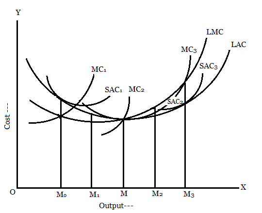
1. Understanding Short-Run Average Cost Curves
In the short run, at least one input, such as plant size or capital, is fixed, leading to a U-shaped SRAC curve. This shape arises due to economies and diseconomies of scale. Initially, as output increases, average costs decline because fixed costs are spread over more units, and specialization improves efficiency. Beyond a certain point, diminishing returns set in, causing average costs to rise. Each SRAC curve reflects a specific fixed input level, so multiple SRAC curves exist, each corresponding to a different plant size or capital stock. For instance, a smaller plant has a higher minimum average cost than a larger plant but may be less efficient at higher outputs.
In the short run, at least one input, such as plant size or capital, is fixed, leading to a U-shaped SRAC curve. This shape arises due to economies and diseconomies of scale. Initially, as output increases, average costs decline because fixed costs are spread over more units, and specialization improves efficiency. Beyond a certain point, diminishing returns set in, causing average costs to rise. Each SRAC curve reflects a specific fixed input level, so multiple SRAC curves exist, each corresponding to a different plant size or capital stock. For instance, a smaller plant has a higher minimum average cost than a larger plant but may be less efficient at higher outputs.
2. The Long-Run Perspective
In the long run, all inputs are variable, allowing firms to fully adjust their production processes to achieve the lowest possible cost for any output level. The LRAC curve is derived by selecting the lowest average cost from the set of SRAC curves for each output. Graphically, imagine a family of U-shaped SRAC curves, each representing a different fixed plant size. The LRAC curve is the envelope of these SRAC curves, formed by connecting the points of minimum cost for each output level across all possible plant sizes. This envelope shows the optimal cost when the firm can choose the most efficient plant size for any given output.
In the long run, all inputs are variable, allowing firms to fully adjust their production processes to achieve the lowest possible cost for any output level. The LRAC curve is derived by selecting the lowest average cost from the set of SRAC curves for each output. Graphically, imagine a family of U-shaped SRAC curves, each representing a different fixed plant size. The LRAC curve is the envelope of these SRAC curves, formed by connecting the points of minimum cost for each output level across all possible plant sizes. This envelope shows the optimal cost when the firm can choose the most efficient plant size for any given output.
3. Derivation Process
To derive the LRAC curve, consider a diagram with multiple SRAC curves, each labeled for a specific plant size (e.g., SRAC₁ for a small plant, SRAC₂ for a medium plant, SRAC₃ for a large plant). For low output levels, SRAC₁ offers the lowest average cost because a small plant is most efficient. As output increases, SRAC₂ becomes cheaper, and for even higher outputs, SRAC₃ is optimal. The LRAC curve traces the lowest points of these SRAC curves, forming a smoother, often U-shaped curve. This shape reflects economies of scale at lower outputs, constant returns to scale at the minimum point, and diseconomies of scale at higher outputs, where coordination and management costs increase.
To derive the LRAC curve, consider a diagram with multiple SRAC curves, each labeled for a specific plant size (e.g., SRAC₁ for a small plant, SRAC₂ for a medium plant, SRAC₃ for a large plant). For low output levels, SRAC₁ offers the lowest average cost because a small plant is most efficient. As output increases, SRAC₂ becomes cheaper, and for even higher outputs, SRAC₃ is optimal. The LRAC curve traces the lowest points of these SRAC curves, forming a smoother, often U-shaped curve. This shape reflects economies of scale at lower outputs, constant returns to scale at the minimum point, and diseconomies of scale at higher outputs, where coordination and management costs increase.
4. Key Characteristics of the LRAC Curve
The LRAC curve is tangent to each SRAC curve at exactly one point, representing the output level where that plant size is most efficient. These tangency points form the LRAC curve, which is typically flatter than individual SRAC curves because it reflects optimal input combinations. The minimum point of the LRAC curve indicates the output level where the firm achieves the lowest possible average cost, known as the minimum efficient scale.
The LRAC curve is tangent to each SRAC curve at exactly one point, representing the output level where that plant size is most efficient. These tangency points form the LRAC curve, which is typically flatter than individual SRAC curves because it reflects optimal input combinations. The minimum point of the LRAC curve indicates the output level where the firm achieves the lowest possible average cost, known as the minimum efficient scale.
Conclusion
The LRAC curve is derived by enveloping the family of SRAC curves, capturing the lowest average cost for each output level when all inputs are variable. This process highlights the firm’s ability to optimize production in the long run, with the LRAC curve serving as a planning tool for cost minimization across varying output levels.
The LRAC curve is derived by enveloping the family of SRAC curves, capturing the lowest average cost for each output level when all inputs are variable. This process highlights the firm’s ability to optimize production in the long run, with the LRAC curve serving as a planning tool for cost minimization across varying output levels.
Section-B
(Attempt all the questions. Each question carries 6 marks.)
Question:-6
What are the characteristics that have to be considered while identifying a Market structure?
Answer:
Characteristics for Identifying Market Structure
Market structure refers to the organizational and competitive features that define how industries operate. Several key characteristics help distinguish different market structures, including perfect competition, monopolistic competition, oligopoly, and monopoly.
1. Number of Buyers and Sellers
The scale of market participants determines competitiveness. In perfect competition, numerous small firms exist, whereas a monopoly has a single dominant seller. Oligopolies feature a few large players influencing prices, while monopolistic competition involves many firms with slight differentiation.
The scale of market participants determines competitiveness. In perfect competition, numerous small firms exist, whereas a monopoly has a single dominant seller. Oligopolies feature a few large players influencing prices, while monopolistic competition involves many firms with slight differentiation.
2. Nature of the Product
Homogeneity or differentiation of goods is crucial. Perfect competition assumes identical products, while monopolistic competition allows branding and minor variations. Oligopolies may sell standardized (e.g., steel) or differentiated products (e.g., smartphones), and monopolies offer unique goods with no close substitutes.
Homogeneity or differentiation of goods is crucial. Perfect competition assumes identical products, while monopolistic competition allows branding and minor variations. Oligopolies may sell standardized (e.g., steel) or differentiated products (e.g., smartphones), and monopolies offer unique goods with no close substitutes.
3. Barriers to Entry and Exit
The ease with which firms can enter or exit a market affects competition. Perfect competition has no barriers, while monopolies hold patents, licenses, or control resources that block competitors. Oligopolies require high capital investments, and monopolistic competition allows relatively free entry but with brand loyalty challenges.
The ease with which firms can enter or exit a market affects competition. Perfect competition has no barriers, while monopolies hold patents, licenses, or control resources that block competitors. Oligopolies require high capital investments, and monopolistic competition allows relatively free entry but with brand loyalty challenges.
4. Degree of Price Control
Firms’ pricing power varies by structure. In perfect competition, firms are price takers, whereas monopolies set prices. Oligopolies engage in strategic pricing (e.g., collusion), and monopolistic competitors have limited control due to product differentiation.
Firms’ pricing power varies by structure. In perfect competition, firms are price takers, whereas monopolies set prices. Oligopolies engage in strategic pricing (e.g., collusion), and monopolistic competitors have limited control due to product differentiation.
5. Elasticity of Demand
Market demand responsiveness differs. Perfectly competitive firms face perfectly elastic demand, while monopolies encounter less elastic demand. Oligopolies and monopolistic competitors deal with varying elasticity based on branding and competition.
Market demand responsiveness differs. Perfectly competitive firms face perfectly elastic demand, while monopolies encounter less elastic demand. Oligopolies and monopolistic competitors deal with varying elasticity based on branding and competition.
6. Non-Price Competition
Advertising and product differentiation play roles where price competition is limited. Monopolistic competition relies heavily on marketing, while oligopolies may compete via innovation. Perfect competition excludes non-price competition, and monopolies seldom need it.
Advertising and product differentiation play roles where price competition is limited. Monopolistic competition relies heavily on marketing, while oligopolies may compete via innovation. Perfect competition excludes non-price competition, and monopolies seldom need it.
Conclusion
These characteristics—number of firms, product nature, entry barriers, pricing power, demand elasticity, and non-price competition—collectively define market structures. Understanding them helps analyze industry behavior, regulatory needs, and economic efficiency.
These characteristics—number of firms, product nature, entry barriers, pricing power, demand elasticity, and non-price competition—collectively define market structures. Understanding them helps analyze industry behavior, regulatory needs, and economic efficiency.
Question:-7
Why should equilibrium between marginal cost and marginal revenue be a necessary condition for equilibrium of a firm?
Answer:
Equilibrium Between Marginal Cost and Marginal Revenue: A Necessary Condition for Firm Equilibrium
In microeconomic theory, a firm reaches equilibrium when it maximizes profit or minimizes loss. The fundamental condition for this equilibrium is the equality of Marginal Cost (MC) and Marginal Revenue (MR). This principle holds across all market structures and is essential for rational decision-making by firms.
1. Profit Maximization Principle
A firm’s profit is maximized when the additional revenue generated from selling one more unit (MR) equals the additional cost of producing that unit (MC). If MR > MC, producing an extra unit adds more to revenue than cost, increasing profit. Conversely, if MR < MC, producing the unit reduces profit. Thus, equilibrium occurs at MC = MR, where no further adjustment in output can improve profitability.
2. Preventing Inefficient Production
Producing beyond the MC = MR point leads to losses on marginal units, as costs exceed revenue. Similarly, stopping production before this equilibrium means missed profit opportunities. Only at MC = MR does the firm ensure it is neither overproducing nor underproducing.
3. Applicability Across Market Structures
- In perfect competition, MR equals price (P), so equilibrium occurs at MC = P.
- In monopoly or imperfect competition, MR declines with output due to downward-sloping demand, making MC = MR crucial for optimal pricing and output.
4. Dynamic Decision-Making
Markets fluctuate, and firms must adjust output based on changing costs and revenues. The MC = MR rule provides a flexible guideline for adapting production levels efficiently, ensuring long-term sustainability.
5. Economic Efficiency
When all firms in an economy operate at MC = MR, resources are allocated efficiently. Overproduction (where MC > MR) wastes inputs, while underproduction (where MR > MC) leaves consumer demand unmet.
Conclusion
The MC = MR equilibrium is indispensable because it ensures profit maximization, prevents inefficiencies, and applies universally across competitive and non-competitive markets. Firms ignoring this rule risk either lost revenue or unnecessary costs, undermining their financial stability. Thus, this condition remains a cornerstone of firm-level and market-level economic analysis.
The MC = MR equilibrium is indispensable because it ensures profit maximization, prevents inefficiencies, and applies universally across competitive and non-competitive markets. Firms ignoring this rule risk either lost revenue or unnecessary costs, undermining their financial stability. Thus, this condition remains a cornerstone of firm-level and market-level economic analysis.
Question:-8
Distinguish between interest and profit. Is it not correct to say that both are earned by the capitalists for the capital they invest in the production process?
Answer:
Distinction Between Interest and Profit
While both interest and profit represent returns on capital investment, they differ fundamentally in their nature, source, and role in economic theory.
1. Definition and Source
- Interest is the fixed return paid to lenders (capital providers) for the use of borrowed funds. It is a contractual obligation, determined by market rates, and is earned irrespective of business performance.
- Profit is the residual income remaining after deducting all costs (including wages, rent, and interest) from total revenue. It is variable, uncertain, and depends on entrepreneurial efficiency and market conditions.
2. Risk and Reward
- Interest is a pre-determined reward for parting with liquidity, carrying relatively low risk since it must be paid even if the firm incurs losses.
- Profit is a residual reward for bearing uncertainty and organizing production. Entrepreneurs earn profits only if revenues exceed costs, making it a high-risk, high-reward return.
3. Functional Role
- Interest compensates for time preference (delayed consumption) and acts as the price of capital. It is tied to loanable funds theory.
- Profit rewards innovation, risk-taking, and managerial skill. Schumpeter viewed it as a temporary surplus from successful entrepreneurship.
4. Distribution
- Interest goes to passive investors (e.g., bondholders, banks) and is treated as a cost of production.
- Profit accrues to active owners (equity holders) and is the engine of capital accumulation and growth.
Are Both Returns to Capitalists?
While capitalists may earn both, conflating them is misleading. Interest is a fixed return for lending capital, whereas profit is a variable surplus from deploying capital productively. Classical economists like Ricardo separated profit (from enterprise) from interest (from abstinence), while Marx distinguished profit as exploitation of labor.
Conclusion
Interest and profit arise from distinct economic functions—one from lending, the other from organizing production. Recognizing this difference is vital for understanding income distribution, investment incentives, and capitalist economies. Both reward capital, but in fundamentally different ways.
Interest and profit arise from distinct economic functions—one from lending, the other from organizing production. Recognizing this difference is vital for understanding income distribution, investment incentives, and capitalist economies. Both reward capital, but in fundamentally different ways.
Question:-9
What are the various sources of profits? Do you think that all profits can be explained in terms of the monopoly power exercised by the producer?
Answer:
The Various Sources of Profits
Profits represent the financial gain a firm earns after deducting all costs from its total revenue. While monopoly power can generate profits, it is not the sole explanation. Profits arise from multiple sources, each reflecting different economic conditions and business strategies.
1. Innovation and Entrepreneurship
Entrepreneurs earn profits by introducing new products, improving processes, or discovering untapped markets. Joseph Schumpeter emphasized "creative destruction," where innovators reap temporary super-normal profits until competitors replicate their ideas.
2. Risk and Uncertainty
Frank Knight distinguished between measurable risk (insurable) and unmeasurable uncertainty. Profits reward entrepreneurs who bear uncertainty, such as fluctuating demand or unforeseen disruptions, which cannot be hedged.
3. Monopoly Power
Firms with monopoly power restrict output and charge higher prices, earning sustained profits. Barriers like patents, control over resources, or government licenses enable this. However, not all profits stem from monopolies—competitive markets also yield profits through efficiency.
4. Market Imperfections
Information asymmetry, transaction costs, and imperfect competition allow firms to exploit gaps, earning abnormal profits. For example, firms with superior market knowledge can outperform rivals.
5. Frictional and Temporary Gains
Short-term profits arise from supply-demand mismatches. A sudden surge in demand (e.g., during a crisis) may boost profits temporarily until supply adjusts.
6. Efficiency and Cost Leadership
Firms minimizing costs through superior technology, management, or economies of scale earn higher profits without monopolistic pricing. Perfectly competitive markets can still yield normal profits in the long run.
Can All Profits Be Attributed to Monopoly Power?
No. While monopolies extract profits via price control, competitive markets reward innovation, risk-taking, and efficiency. Classical economists like Adam Smith linked profits to productive labor, whereas modern theories highlight dynamic competition. Even in oligopolies, profits stem from strategic behavior rather than pure monopoly power.
Conclusion
Profits originate from diverse factors—innovation, risk-bearing, efficiency, and market conditions—not just monopoly power. While monopolistic profits exist, competitive and entrepreneurial profits are equally significant, reflecting the multifaceted nature of economic value creation.
Profits originate from diverse factors—innovation, risk-bearing, efficiency, and market conditions—not just monopoly power. While monopolistic profits exist, competitive and entrepreneurial profits are equally significant, reflecting the multifaceted nature of economic value creation.
Question:-10
What is full-cost pricing principle? Does it lead to a higher than optimum production?
Answer:
Full-Cost Pricing Principle and Its Impact on Production
The full-cost pricing principle is a pricing strategy where firms set prices by adding a markup to the total cost of production, covering both variable and fixed costs while ensuring a predetermined profit margin. This approach contrasts with marginal cost pricing and is particularly common in manufacturing and service industries where cost recovery is essential for business sustainability.
Key Features of Full-Cost Pricing:
- Cost-Plus Calculation: Prices are determined by calculating average total costs (including overheads) and adding a standard profit margin.
- Price Stability: It provides stable and predictable pricing, beneficial for long-term planning and contracts.
- Risk Aversion: Ensures all costs are covered, reducing the risk of losses, especially in industries with high fixed costs.
Does It Lead to Higher-Than-Optimum Production?
In competitive markets, full-cost pricing can potentially lead to overproduction. Here’s why:
- Demand Insensitivity: Since prices are cost-based rather than demand-based, firms may produce quantities that don’t align with market equilibrium, creating surplus inventory if demand is insufficient.
- Rigid Markups: Fixed profit margins ignore price elasticity of demand. If consumers are price-sensitive, high markups may reduce sales, leaving firms with unsold stock.
- Barriers to Efficiency: Unlike marginal cost pricing, which encourages production up to the point where marginal cost equals marginal revenue, full-cost pricing lacks this efficiency incentive, potentially resulting in suboptimal output levels.
However, in monopolistic or oligopolistic markets, firms using full-cost pricing might restrict output to maintain higher prices, leading to underproduction instead. The principle’s impact on production volume thus depends on market structure and demand conditions.
Conclusion
While full-cost pricing ensures cost recovery and simplifies pricing decisions, it may not always align production with market equilibrium. In competitive environments, it risks overproduction due to inflexible pricing, whereas in less competitive markets, it could contribute to artificial scarcity. Businesses must weigh these trade-offs when adopting this pricing strategy.
Section-C
(Attempt all the questions. Each question carries 5 marks.)
Question:-11
Write a short note on the claimed superiority of indifference curves analysis over utility analysis.
Answer:
The Claimed Superiority of Indifference Curve Analysis Over Utility Analysis
Indifference curve analysis is considered superior to traditional utility analysis for several key reasons. First, it eliminates the need for cardinal measurement of utility, which utility analysis relies upon. While utility analysis assumes that satisfaction can be quantified numerically (e.g., in "utils"), indifference curves only require ordinal ranking of preferences, making the analysis more realistic and behaviorally plausible.
Second, indifference curve analysis provides a more robust framework for understanding consumer choices. It visually represents consumer preferences through indifference curves and budget constraints, allowing for clearer demonstration of equilibrium points where the marginal rate of substitution equals the price ratio. This graphical approach avoids the abstract assumptions of diminishing marginal utility, instead relying on observable substitution effects.
Additionally, indifference curves better handle complex scenarios such as income and substitution effects of price changes. The Hicksian decomposition, which separates these effects, is more precise under indifference curve analysis than under utility analysis. It also avoids the restrictive assumption of constant marginal utility of money, which often leads to inconsistencies in utility-based demand theory.
Finally, indifference curve analysis can accommodate exceptions like Giffen goods more convincingly by illustrating how income effects can dominate substitution effects. Thus, by being more flexible, visually intuitive, and less dependent on unrealistic assumptions, indifference curve analysis offers a more rigorous and practical tool for microeconomic theory.
Question:-12
How the various tools of government intervention are applied while determining the price?
Answer:
Government Intervention in Price Determination
Governments use various tools to influence prices, ensuring market stability, affordability, and fairness. These interventions are particularly crucial in essential sectors like food, healthcare, and utilities.
- Price Ceilings: Governments set maximum prices (e.g., rent controls) to prevent exploitation during shortages. While they enhance affordability, they may lead to black markets or reduced supply if set below equilibrium.
- Price Floors: Minimum prices (e.g., agricultural support prices) protect producers from volatile markets. However, surpluses may arise if the floor exceeds market-clearing levels.
- Subsidies: By lowering production costs, subsidies reduce market prices (e.g., fuel or fertilizer subsidies). This encourages consumption but may strain public finances.
- Taxation: Indirect taxes (e.g., GST, excise duties) raise prices to discourage consumption of harmful goods (e.g., tobacco) or to generate revenue.
- Buffer Stocks: Governments stabilize prices by buying surplus stock during abundance and releasing it during scarcity (e.g., food grains).
- Direct Price Controls: In emergencies, governments may fix prices for essentials (e.g., medicines), though this risks supply distortions.
- Trade Policies: Tariffs, quotas, or import bans adjust domestic prices by regulating foreign competition (e.g., protecting local farmers).
Conclusion:
While these tools address market failures, their effectiveness depends on implementation. Over-regulation may distort incentives, whereas balanced interventions can promote equitable growth. Policymakers must carefully assess trade-offs to ensure sustainable price stability.
While these tools address market failures, their effectiveness depends on implementation. Over-regulation may distort incentives, whereas balanced interventions can promote equitable growth. Policymakers must carefully assess trade-offs to ensure sustainable price stability.
Question:-13
What is backward bending supply curve? Explain with an example.
Answer:
Backward Bending Supply Curve of Labour
The backward bending supply curve illustrates an unusual phenomenon where the supply of labor decreases as wages rise beyond a certain point. This occurs due to the interplay between the income effect and substitution effect in labor economics.
Initially, as wages increase (substitution effect), workers are incentivized to work more hours since leisure becomes more expensive in terms of lost earnings. However, beyond a certain wage level (income effect), higher income allows workers to "purchase" more leisure time by working fewer hours while maintaining their desired standard of living.
Example:
Consider a software engineer earning ₹1,000/hour. At lower wages, they might work 60-hour weeks to maximize income. But if their wage rises to ₹2,500/hour, they could achieve their financial goals in just 30 hours. The engineer may then prefer leisure over additional work, causing the labor supply curve to bend backward.
Consider a software engineer earning ₹1,000/hour. At lower wages, they might work 60-hour weeks to maximize income. But if their wage rises to ₹2,500/hour, they could achieve their financial goals in just 30 hours. The engineer may then prefer leisure over additional work, causing the labor supply curve to bend backward.
Key Implications:
- Challenges the classical assumption that higher wages always increase labor supply
- Particularly relevant for high-income professionals
- Demonstrates how non-monetary factors (leisure preference) influence economic decisions
This concept highlights that human behavior doesn’t always follow conventional economic predictions, emphasizing the psychological dimensions of labor economics. The backward bend typically appears in developed economies where workers have greater discretion over their working hours.
Question:-14
Define functional distribution and distinguish it from personal distribution.
Answer:
Functional vs. Personal Distribution of Income
Functional distribution refers to how national income is divided among the factors of production – land (rent), labor (wages), capital (interest), and entrepreneurship (profits). It examines income shares based on the economic function performed, showing what portion of total income goes to each productive input. For instance, a country might allocate 60% to wages, 20% to profits, 15% to interest, and 5% to rent.
Personal distribution focuses on how income is distributed among individuals or households regardless of income sources. It measures income inequality by showing what percentage of total income is received by different population segments (e.g., top 10% vs. bottom 20%).
Key Differences:
- Basis of Distribution: Functional looks at income by economic role; personal examines actual people/households
- Measurement Approach: Functional uses factor shares; personal uses income percentiles or Gini coefficients
- Policy Implications: Functional analysis informs production efficiency; personal distribution guides social welfare policies
For example, two economies may have identical functional distributions (same wage/profit ratios) but vastly different personal distributions if one has concentrated capital ownership. While functional distribution reflects market mechanisms of factor payments, personal distribution reveals societal inequality patterns, making both perspectives essential for comprehensive economic analysis. Functional distribution is more relevant for understanding production, while personal distribution matters for consumption patterns and social justice debates.
BCOG-171 हल किया गया असाइनमेंट 2025
एक खंड
(सभी प्रश्नों के उत्तर दीजिए। प्रत्येक प्रश्न 10 अंक का है।)
प्रश्न:-1
उत्पादन संभावना वक्र की अवधारणा को समझाइए। इसकी मान्यताओं को सूचीबद्ध कीजिए। एक उदाहरण की सहायता से इसे स्पष्ट कीजिए।
उत्तर:
1. उत्पादन संभावना वक्र को समझना
उत्पादन संभावना वक्र (पीपीसी), जिसे उत्पादन संभावना सीमा (पीपीएफ) भी कहा जाता है, एक मूलभूत आर्थिक मॉडल है जो दो वस्तुओं या सेवाओं के अधिकतम संभव संयोजनों को दर्शाता है जिन्हें कोई अर्थव्यवस्था अपने संसाधनों और तकनीक के पूर्ण और कुशल उपयोग के आधार पर उत्पादित कर सकती है। यह वक्र अर्थशास्त्र के मूल सिद्धांतों - व्यापार-नापसंद, अवसर लागत और दुर्लभता - को रेखांकन के माध्यम से दर्शाता है। सभी संभावित उत्पादन संयोजनों को दर्शाकर, पीपीसी उत्पादन की सीमाओं और एक वस्तु से दूसरी वस्तु में संसाधनों के पुनर्वितरण के लिए आवश्यक त्यागों को दर्शाता है।
2. उत्पादन संभावना वक्र की प्रमुख मान्यताएँ
पीपीसी स्पष्टता बनाए रखने और इसके मूल सिद्धांतों पर ध्यान केंद्रित करने के लिए कई सरल मान्यताओं पर आधारित है:
- स्थिर संसाधन: अर्थव्यवस्था में श्रम, पूंजी, भूमि और अन्य इनपुट की सीमित मात्रा होती है।
- निरंतर प्रौद्योगिकी: विश्लेषण की अवधि के दौरान तकनीकी प्रगति या प्रतिगमन नहीं होता है।
- पूर्ण दक्षता: सभी संसाधनों का इष्टतम उपयोग किया जाता है, बिना किसी अपव्यय या बेरोजगारी के।
- दो-वस्तु अर्थव्यवस्था: यह मॉडल मानता है कि केवल दो वस्तुओं का उत्पादन किया जाता है, जिससे व्यापार-नापसंद का विश्लेषण सरल हो जाता है।
- विभाज्य संसाधन: उत्पादन के कारकों को बिना किसी घर्षण के दो वस्तुओं के बीच सुचारू रूप से पुनः आवंटित किया जा सकता है।
ये मान्यताएं एक आदर्श ढांचा तैयार करती हैं, जिससे अर्थशास्त्रियों को संसाधन आवंटन और अवसर लागत के प्रभावों को अलग करने में मदद मिलती है।
3. उत्पादन संभावना वक्र को एक उदाहरण के साथ चित्रित करना
एक ऐसी अर्थव्यवस्था पर विचार करें जो केवल दो वस्तुओं का उत्पादन करती है: गेहूँ (एक मुख्य फसल) और कारें (एक निर्मित वस्तु)। पीपीसी निम्नलिखित उत्पादन संयोजनों को दर्शा सकता है:
- बिन्दु A: 10,000 टन गेहूं और 0 कारें।
- बिन्दु B: 8,000 टन गेहूं और 1,000 कारें।
- बिन्दु C: 5,000 टन गेहूं और 2,000 कारें।
- बिंदु D: 0 टन गेहूं और 3,000 कारें।
इन बिंदुओं को जोड़ने वाला वक्र अवतल (बाहर की ओर झुका हुआ) है, जो बढ़ती अवसर लागतों को दर्शाता है। जैसे-जैसे अर्थव्यवस्था गेहूँ से कार उत्पादन की ओर संसाधनों का स्थानांतरण करती है, प्रत्येक अतिरिक्त कार के लिए गेहूँ की अधिक मात्रा का त्याग करना पड़ता है। यह आकार इसलिए बनता है क्योंकि संसाधन दोनों उद्योगों के लिए पूरी तरह से अनुकूल नहीं हैं—कुछ भूमि और श्रम खेती के लिए बेहतर हैं, जबकि अन्य विनिर्माण में अधिक कुशल हैं।
वक्र के अंदर के बिंदु (जैसे, 4,000 टन गेहूँ और 1,000 कारें) अकुशलता, जैसे बेरोज़गारी या गलत आवंटन, दर्शाते हैं। वक्र के बाहर के बिंदु वर्तमान संसाधनों और तकनीक से अप्राप्य हैं, हालाँकि आर्थिक विकास (बढ़े हुए संसाधनों या बेहतर तकनीक के ज़रिए) समय के साथ PPC को बाहर की ओर स्थानांतरित कर सकता है।
निष्कर्ष
उत्पादन संभावना वक्र आर्थिक बाधाओं और समझौतों को समझने के लिए एक शक्तिशाली उपकरण के रूप में कार्य करता है। अपनी मूल मान्यताओं का पालन करते हुए, यह मॉडल अवसर लागत की अवधारणा और संसाधन आवंटन में विकल्प की आवश्यकता को स्पष्ट करता है। गेहूँ और कारों के उदाहरण जैसे वास्तविक-विश्व अनुप्रयोग दर्शाते हैं कि अभाव की स्थिति में कल्याण को अधिकतम करने के लिए समाजों को उत्पादन को कैसे प्राथमिकता देनी चाहिए। सरल होते हुए भी, पीपीसी आर्थिक दक्षता, विकास क्षमता और सभी अर्थव्यवस्थाओं के सामने आने वाली अंतर्निहित सीमाओं की एक आधारभूत समझ प्रदान करता है।
प्रश्न:-2
माँग अनुसूची और माँग वक्र की सहायता से माँग के नियम की व्याख्या कीजिए। प्रतिस्थापन और आय प्रभावों के बीच अंतर का उपयोग करते हुए इसके अपवाद की भी व्याख्या कीजिए।
उत्तर:
1. मांग का नियम: परिभाषा और मूल सिद्धांत
माँग का नियम अर्थशास्त्र की एक आधारभूत अवधारणा है जो कहती है कि, अन्य सभी परिस्थितियाँ समान होने पर, किसी वस्तु या सेवा की माँग की मात्रा उसकी कीमत बढ़ने पर घटती है, और इसके विपरीत भी। यह व्युत्क्रम संबंध उपभोक्ता व्यवहार से उत्पन्न होता है—जब कीमतें बढ़ती हैं, तो क्रय शक्ति कम हो जाती है, जिससे खरीदार विकल्प तलाशते हैं या खपत कम कर देते हैं। इसके विपरीत, कम कीमतें वस्तुओं को अधिक आकर्षक बनाती हैं, जिससे माँग बढ़ती है। यह नियम यह मानता है कि माँग को प्रभावित करने वाले अन्य कारक, जैसे आय, रुचियाँ और संबंधित वस्तुओं की कीमतें, स्थिर रहती हैं।
2. मांग अनुसूची और मांग वक्र
माँग अनुसूची, कीमत और माँगी गई मात्रा के बीच के संबंध का एक सारणीबद्ध निरूपण है। उदाहरण के लिए, सेब की माँग पर विचार करें:
| प्रति सेब कीमत ($) | मांग की गई मात्रा (प्रति सप्ताह) |
|---|---|
| 1.00 | 100 |
| 1.50 | 80 |
| 2.00 | 60 |
| 2.50 | 40 |
| 3.00 | 20 |
जैसे ही कीमत 1.00 डॉलर से बढ़कर 3.00 डॉलर हो जाती है, मांग की मात्रा 100 से घटकर 20 सेब हो जाती है, जो मांग के नियम को दर्शाता है।
माँग वक्र इस अनुसूची को एक ग्राफ़िकल प्रारूप में परिवर्तित करता है, जिसमें ऊर्ध्वाधर अक्ष पर कीमत और क्षैतिज अक्ष पर मात्रा दर्शाई जाती है। उपरोक्त आँकड़ों को आलेखित करने पर एक नीचे की ओर ढलान वाला वक्र प्राप्त होता है, जो व्युत्क्रम मूल्य-मात्रा संबंध को दृष्टिगत रूप से पुष्ट करता है। यह ढलान उपभोक्ताओं की कम कीमतों पर अधिक खरीदने की इच्छा को दर्शाता है, जो इस नियम के सार को दर्शाता है।
3. मांग के नियम के अपवाद: प्रतिस्थापन बनाम आय प्रभाव
यद्यपि मांग का नियम सामान्यतः लागू होता है, प्रतिस्थापन प्रभाव और आय प्रभाव की परस्पर क्रिया के कारण अपवाद उत्पन्न होते हैं :
- प्रतिस्थापन प्रभाव: जब किसी वस्तु की कीमत बढ़ती है, तो उपभोक्ता सस्ते विकल्पों की ओर रुख करते हैं (जैसे, सेब महंगे होने पर संतरे चुनना)। यह माँग के नियम को पुष्ट करता है।
- आय प्रभाव: मूल्य परिवर्तन से क्रय शक्ति में परिवर्तन होता है। सामान्य वस्तुओं के लिए, ऊँची कीमतें वास्तविक आय को कम करती हैं, जिससे माँग और कम हो जाती है। हालाँकि, गिफेन वस्तुओं (एक दुर्लभ अपवाद) के लिए, आय प्रभाव हावी रहता है।
गिफेन वस्तुएँ अपवाद:
मुख्य खाद्य पदार्थों (जैसे, कम आय वाले क्षेत्रों में चावल) जैसी घटिया वस्तुएँ कानून की अवहेलना कर सकती हैं यदि मूल्य वृद्धि उपभोक्ताओं को विकल्प खरीदने में असमर्थ बना दे। उदाहरण के लिए, यदि चावल की कीमतें बढ़ती हैं, तो परिवार अधिक महंगे प्रोटीन का सेवन कम कर सकते हैं और लागत के बावजूद और भी अधिक चावल खरीद सकते हैं, और बुनियादी जीविका को प्राथमिकता दे सकते हैं। यहाँ, आय प्रभाव प्रतिस्थापन प्रभाव से अधिक होता है, जिससे एक ऊपर की ओर झुका हुआ माँग वक्र खंड बनता है।
मुख्य खाद्य पदार्थों (जैसे, कम आय वाले क्षेत्रों में चावल) जैसी घटिया वस्तुएँ कानून की अवहेलना कर सकती हैं यदि मूल्य वृद्धि उपभोक्ताओं को विकल्प खरीदने में असमर्थ बना दे। उदाहरण के लिए, यदि चावल की कीमतें बढ़ती हैं, तो परिवार अधिक महंगे प्रोटीन का सेवन कम कर सकते हैं और लागत के बावजूद और भी अधिक चावल खरीद सकते हैं, और बुनियादी जीविका को प्राथमिकता दे सकते हैं। यहाँ, आय प्रभाव प्रतिस्थापन प्रभाव से अधिक होता है, जिससे एक ऊपर की ओर झुका हुआ माँग वक्र खंड बनता है।
वेबलेन वस्तुएँ अपवाद:
विलासिता की वस्तुओं (जैसे, डिज़ाइनर हैंडबैग) की माँग कीमतों में वृद्धि के साथ बढ़ सकती है क्योंकि उनकी कथित प्रतिष्ठा बढ़ जाती है। उपभोक्ता महँगे दामों को विशिष्टता से जोड़ते हैं, जिससे ये वस्तुएँ व्यावहारिक उपयोगिता से परे भी वांछनीय हो जाती हैं।
विलासिता की वस्तुओं (जैसे, डिज़ाइनर हैंडबैग) की माँग कीमतों में वृद्धि के साथ बढ़ सकती है क्योंकि उनकी कथित प्रतिष्ठा बढ़ जाती है। उपभोक्ता महँगे दामों को विशिष्टता से जोड़ते हैं, जिससे ये वस्तुएँ व्यावहारिक उपयोगिता से परे भी वांछनीय हो जाती हैं।
निष्कर्ष
माँग का नियम नीचे की ओर झुके हुए माँग वक्रों और अनुसूचियों के माध्यम से विशिष्ट उपभोक्ता व्यवहार को खूबसूरती से दर्शाता है। हालाँकि, गिफेन और वेबलन वस्तुओं जैसे अपवाद सूक्ष्म परिदृश्यों को उजागर करते हैं जहाँ मनोवैज्ञानिक या आर्थिक बाधाएँ मानक प्रतिमानों पर हावी हो जाती हैं। प्रतिस्थापन और आय प्रभावों के बीच के अंतर को समझना इन विसंगतियों की व्याख्या करने के लिए महत्वपूर्ण है, जो दर्शाता है कि वास्तविक दुनिया के बाज़ारों में माँग की गतिशीलता साधारण मूल्य-मात्रा संबंधों से आगे तक फैली हुई है।
प्रश्न:-3
आरेखों की सहायता से पूर्णतया प्रत्यास्थ, पूर्णतया अप्रत्यास्थ, इकाई प्रत्यास्थ, अप्रत्यास्थ तथा प्रत्यास्थ आपूर्ति वक्रों के बीच अंतर स्पष्ट करें।
उत्तर:
पूर्णतया प्रत्यास्थ, पूर्णतया अप्रत्यास्थ, इकाई प्रत्यास्थ, अप्रत्यास्थ, तथा प्रत्यास्थ आपूर्ति वक्रों के बीच अंतर करना
आपूर्ति लोच की अवधारणा यह मापती है कि किसी वस्तु या सेवा की आपूर्ति की मात्रा उसकी कीमत में परिवर्तन के प्रति कितनी संवेदनशील है। आपूर्ति लोच विभिन्न परिदृश्यों में भिन्न होती है, जिसके परिणामस्वरूप आपूर्ति वक्र के आकार अलग-अलग होते हैं। यह निबंध पूर्णतः लोचदार, पूर्णतः अलोचदार, इकाई लोचदार, अलोचदार और लोचदार आपूर्ति वक्रों का अन्वेषण करता है, और उनकी विशेषताओं को वैचारिक आरेखों द्वारा दर्शाता है।
1. पूर्णतः लोचदार आपूर्ति वक्र
एक पूर्णतः लोचदार आपूर्ति वक्र उस स्थिति को दर्शाता है जहाँ आपूर्तिकर्ता किसी वस्तु की किसी भी मात्रा को एक विशिष्ट मूल्य पर प्रदान करने को तैयार होते हैं, लेकिन कम मूल्य पर बिल्कुल भी नहीं। यह वक्र क्षैतिज होता है, जो अनंत लोच को दर्शाता है। दी गई कीमत पर, आपूर्ति की मात्रा शून्य से अनंत तक हो सकती है, लेकिन किसी भी मूल्य में कमी से आपूर्ति शून्य हो जाती है। यह स्थिति अक्सर समान उत्पादों वाले अत्यधिक प्रतिस्पर्धी बाज़ारों में उत्पन्न होती है, जहाँ आपूर्तिकर्ता लागत में बदलाव किए बिना उत्पादन को तुरंत समायोजित कर सकते हैं। उदाहरण के लिए, ऐसे बाज़ार में जहाँ वस्तुओं का उत्पादन एक निश्चित लागत पर होता है और क्षमता की कोई सीमा नहीं होती, आपूर्ति वक्र उस लागत स्तर पर सपाट रहता है।
एक पूर्णतः लोचदार आपूर्ति वक्र उस स्थिति को दर्शाता है जहाँ आपूर्तिकर्ता किसी वस्तु की किसी भी मात्रा को एक विशिष्ट मूल्य पर प्रदान करने को तैयार होते हैं, लेकिन कम मूल्य पर बिल्कुल भी नहीं। यह वक्र क्षैतिज होता है, जो अनंत लोच को दर्शाता है। दी गई कीमत पर, आपूर्ति की मात्रा शून्य से अनंत तक हो सकती है, लेकिन किसी भी मूल्य में कमी से आपूर्ति शून्य हो जाती है। यह स्थिति अक्सर समान उत्पादों वाले अत्यधिक प्रतिस्पर्धी बाज़ारों में उत्पन्न होती है, जहाँ आपूर्तिकर्ता लागत में बदलाव किए बिना उत्पादन को तुरंत समायोजित कर सकते हैं। उदाहरण के लिए, ऐसे बाज़ार में जहाँ वस्तुओं का उत्पादन एक निश्चित लागत पर होता है और क्षमता की कोई सीमा नहीं होती, आपूर्ति वक्र उस लागत स्तर पर सपाट रहता है।
2. पूर्णतः अलोचदार आपूर्ति वक्र
इसके विपरीत, पूर्णतः अलोचदार आपूर्ति वक्र ऊर्ध्वाधर होता है, जो शून्य लोच को दर्शाता है। यहाँ, आपूर्ति की मात्रा मूल्य परिवर्तन के बावजूद स्थिर रहती है। ऐसा तब होता है जब संसाधन स्थिर होते हैं और उन्हें बढ़ाया नहीं जा सकता, जैसे कि दुर्लभ कलाकृतियाँ या किसी विशिष्ट स्थान पर स्थित भूमि जैसी विशिष्ट संपत्तियाँ। कीमत कितनी भी ऊँची या नीची क्यों न हो, आपूर्ति की मात्रा में कोई परिवर्तन नहीं होता। उदाहरण के लिए, एक विशिष्ट पेंटिंग की आपूर्ति एक इकाई पर स्थिर होती है, जिससे उसका आपूर्ति वक्र पूर्णतः ऊर्ध्वाधर हो जाता है।
इसके विपरीत, पूर्णतः अलोचदार आपूर्ति वक्र ऊर्ध्वाधर होता है, जो शून्य लोच को दर्शाता है। यहाँ, आपूर्ति की मात्रा मूल्य परिवर्तन के बावजूद स्थिर रहती है। ऐसा तब होता है जब संसाधन स्थिर होते हैं और उन्हें बढ़ाया नहीं जा सकता, जैसे कि दुर्लभ कलाकृतियाँ या किसी विशिष्ट स्थान पर स्थित भूमि जैसी विशिष्ट संपत्तियाँ। कीमत कितनी भी ऊँची या नीची क्यों न हो, आपूर्ति की मात्रा में कोई परिवर्तन नहीं होता। उदाहरण के लिए, एक विशिष्ट पेंटिंग की आपूर्ति एक इकाई पर स्थिर होती है, जिससे उसका आपूर्ति वक्र पूर्णतः ऊर्ध्वाधर हो जाता है।
3. इकाई लोचदार आपूर्ति वक्र:
एक इकाई लोचदार आपूर्ति वक्र यह दर्शाता है कि कीमत में एक प्रतिशत परिवर्तन आपूर्ति की मात्रा में समान प्रतिशत परिवर्तन का कारण बनता है, जिसके परिणामस्वरूप एक लोच प्राप्त होती है। ग्राफ़िक रूप से, यह वक्र मूल बिंदु से होकर गुजरता है और अक्सर एक विशिष्ट ढलान वाली एक सीधी रेखा होती है, हालाँकि इसका सटीक आकार पैमाने पर निर्भर करता है। व्यावहारिक रूप से, यह संतुलन उन उद्योगों में होता है जहाँ उत्पादन लागत उत्पादन के अनुपात में बढ़ती है, जैसे कि मापनीय इनपुट वाले कुछ विनिर्माण क्षेत्रों में।
एक इकाई लोचदार आपूर्ति वक्र यह दर्शाता है कि कीमत में एक प्रतिशत परिवर्तन आपूर्ति की मात्रा में समान प्रतिशत परिवर्तन का कारण बनता है, जिसके परिणामस्वरूप एक लोच प्राप्त होती है। ग्राफ़िक रूप से, यह वक्र मूल बिंदु से होकर गुजरता है और अक्सर एक विशिष्ट ढलान वाली एक सीधी रेखा होती है, हालाँकि इसका सटीक आकार पैमाने पर निर्भर करता है। व्यावहारिक रूप से, यह संतुलन उन उद्योगों में होता है जहाँ उत्पादन लागत उत्पादन के अनुपात में बढ़ती है, जैसे कि मापनीय इनपुट वाले कुछ विनिर्माण क्षेत्रों में।
4. अलोचदार आपूर्ति वक्र
एक अलोचदार आपूर्ति वक्र अपेक्षाकृत ढलान वाला होता है, जो दर्शाता है कि आपूर्ति की मात्रा में कीमत की तुलना में कम प्रतिशत परिवर्तन होता है। यहाँ लोच एक से कम है। यह सीमित उत्पादन क्षमता या उच्च समायोजन लागत वाली वस्तुओं के लिए सामान्य है, जैसे कि अल्पावधि में कृषि उत्पाद, जहाँ भूमि और समय की कमी उत्पादन में तीव्र वृद्धि को रोकती है। एक ढलान वाला वक्र आपूर्तिकर्ताओं की मूल्य परिवर्तनों पर शीघ्र प्रतिक्रिया करने की सीमित क्षमता को दर्शाता है।
एक अलोचदार आपूर्ति वक्र अपेक्षाकृत ढलान वाला होता है, जो दर्शाता है कि आपूर्ति की मात्रा में कीमत की तुलना में कम प्रतिशत परिवर्तन होता है। यहाँ लोच एक से कम है। यह सीमित उत्पादन क्षमता या उच्च समायोजन लागत वाली वस्तुओं के लिए सामान्य है, जैसे कि अल्पावधि में कृषि उत्पाद, जहाँ भूमि और समय की कमी उत्पादन में तीव्र वृद्धि को रोकती है। एक ढलान वाला वक्र आपूर्तिकर्ताओं की मूल्य परिवर्तनों पर शीघ्र प्रतिक्रिया करने की सीमित क्षमता को दर्शाता है।
5. लोचदार आपूर्ति वक्र:
एक लोचदार आपूर्ति वक्र अपेक्षाकृत सपाट होता है, जो दर्शाता है कि आपूर्ति की मात्रा, कीमत की तुलना में बड़े प्रतिशत से बदलती है, और इसकी लोच एक से अधिक होती है। ऐसा लचीली उत्पादन प्रक्रियाओं वाले उद्योगों में होता है, जैसे उपभोक्ता इलेक्ट्रॉनिक्स, जहाँ निर्माता मूल्य वृद्धि के जवाब में उत्पादन में तेज़ी से वृद्धि कर सकते हैं। सपाट ढलान मूल्य परिवर्तनों के प्रति महत्वपूर्ण संवेदनशीलता दर्शाता है।
एक लोचदार आपूर्ति वक्र अपेक्षाकृत सपाट होता है, जो दर्शाता है कि आपूर्ति की मात्रा, कीमत की तुलना में बड़े प्रतिशत से बदलती है, और इसकी लोच एक से अधिक होती है। ऐसा लचीली उत्पादन प्रक्रियाओं वाले उद्योगों में होता है, जैसे उपभोक्ता इलेक्ट्रॉनिक्स, जहाँ निर्माता मूल्य वृद्धि के जवाब में उत्पादन में तेज़ी से वृद्धि कर सकते हैं। सपाट ढलान मूल्य परिवर्तनों के प्रति महत्वपूर्ण संवेदनशीलता दर्शाता है।
निष्कर्ष:
पूर्णतः लोचदार, पूर्णतः अलोचदार, इकाई लोचदार, अलोचदार और लोचदार आपूर्ति वक्रों के बीच के अंतर, मूल्य परिवर्तनों के प्रति आपूर्ति की मात्रा की बदलती संवेदनशीलता को दर्शाते हैं। प्रत्येक वक्र, स्थिर संसाधनों से लेकर लचीली उत्पादन प्रणालियों तक, विशिष्ट बाजार स्थितियों को दर्शाता है। इन अंतरों को समझने से यह विश्लेषण करने में मदद मिलती है कि आपूर्तिकर्ता मूल्य में उतार-चढ़ाव पर कैसे प्रतिक्रिया करते हैं, और विविध संदर्भों में आर्थिक निर्णय लेने में मदद मिलती है।
पूर्णतः लोचदार, पूर्णतः अलोचदार, इकाई लोचदार, अलोचदार और लोचदार आपूर्ति वक्रों के बीच के अंतर, मूल्य परिवर्तनों के प्रति आपूर्ति की मात्रा की बदलती संवेदनशीलता को दर्शाते हैं। प्रत्येक वक्र, स्थिर संसाधनों से लेकर लचीली उत्पादन प्रणालियों तक, विशिष्ट बाजार स्थितियों को दर्शाता है। इन अंतरों को समझने से यह विश्लेषण करने में मदद मिलती है कि आपूर्तिकर्ता मूल्य में उतार-चढ़ाव पर कैसे प्रतिक्रिया करते हैं, और विविध संदर्भों में आर्थिक निर्णय लेने में मदद मिलती है।
प्रश्न:-4
सीमांत प्रतिस्थापन दर से आपका क्या तात्पर्य है? X की मात्रा बढ़ाने पर Y के लिए X की सीमांत प्रतिस्थापन दर क्यों गिर जाती है?
उत्तर:
1. प्रतिस्थापन की सीमांत दर को समझना
प्रतिस्थापन की सीमांत दर (MRS) उपभोक्ता विकल्प सिद्धांत की एक मूलभूत अवधारणा है जो उस दर को मापती है जिस पर एक उपभोक्ता उपयोगिता (संतुष्टि) के समान स्तर को बनाए रखते हुए एक वस्तु (Y) को छोड़कर दूसरी वस्तु (X) की एक अतिरिक्त इकाई प्राप्त करने को तैयार होता है। गणितीय रूप से, यह किसी भी दिए गए बिंदु पर उदासीनता वक्र का ढलान है और इसे इस प्रकार व्यक्त किया जाता है:
नकारात्मक चिह्न दो वस्तुओं के बीच व्यापार-बंद को इंगित करता है - उपभोक्ताओं को अपनी समग्र संतुष्टि में परिवर्तन किए बिना, X की अधिक मात्रा प्राप्त करने के लिए Y की कुछ मात्रा का त्याग करना होगा।
2. X के बढ़ने पर Y के लिए X का MRS क्यों घट जाता है?
प्रतिस्थापन की घटती सीमांत दर का सिद्धांत कहता है कि जैसे-जैसे उपभोक्ता वस्तु X की अधिक मात्रा प्राप्त करता है, X की अतिरिक्त इकाइयों के लिए वस्तु Y को छोड़ने की इच्छा कम होती जाती है। ऐसा दो प्रमुख आर्थिक व्यवहारों के कारण होता है:
- घटती सीमांत उपयोगिता:
जैसे-जैसे X की खपत बढ़ती है, X की प्रत्येक अतिरिक्त इकाई से प्राप्त अतिरिक्त संतुष्टि (सीमांत उपयोगिता) घटती जाती है। परिणामस्वरूप, उपभोक्ता अधिक X प्राप्त करने के लिए Y की बड़ी मात्रा का त्याग करने के लिए कम इच्छुक होता है, जिससे MRS कम हो जाता है। - सापेक्षिक दुर्लभता और प्राथमिकताएँ:
जब किसी उपभोक्ता के पास X की मात्रा कम और Y की मात्रा ज़्यादा होती है, तो वह X को बहुत महत्व देता है और उसके बदले Y की एक बड़ी मात्रा देने को तैयार रहता है। हालाँकि, जैसे-जैसे X प्रचुर मात्रा में उपलब्ध होता जाता है, उसका सापेक्षिक महत्व कम होता जाता है, और उपभोक्ता Y को छोड़ने के लिए अनिच्छुक हो जाता है, जो अब अपेक्षाकृत दुर्लभ और अधिक मूल्यवान हो जाता है।
उदाहरण:
मान लीजिए कि एक उपभोक्ता चाय (X) और कॉफ़ी (Y) में से किसी एक को चुनता है। शुरुआत में, कुछ ही कप चाय के साथ, उपभोक्ता एक अतिरिक्त कप चाय के लिए 3 कप कॉफ़ी छोड़ सकता है (MRS = 3)। जैसे-जैसे चाय की मात्रा बढ़ती जाती है, उपभोक्ता एक और चाय के लिए केवल 1 कप कॉफ़ी छोड़ सकता है (MRS = 1), और अंततः, केवल 0.5 कप (MRS = 0.5)। यह घटता हुआ समझौता घटती हुई MRS को दर्शाता है।
मान लीजिए कि एक उपभोक्ता चाय (X) और कॉफ़ी (Y) में से किसी एक को चुनता है। शुरुआत में, कुछ ही कप चाय के साथ, उपभोक्ता एक अतिरिक्त कप चाय के लिए 3 कप कॉफ़ी छोड़ सकता है (MRS = 3)। जैसे-जैसे चाय की मात्रा बढ़ती जाती है, उपभोक्ता एक और चाय के लिए केवल 1 कप कॉफ़ी छोड़ सकता है (MRS = 1), और अंततः, केवल 0.5 कप (MRS = 0.5)। यह घटता हुआ समझौता घटती हुई MRS को दर्शाता है।
3. घटती एमआरएस के निहितार्थ
- उत्तल अनधिमान वक्र:
घटती हुई MRS यह स्पष्ट करती है कि अनधिमान वक्र मूल बिंदु की ओर उत्तल क्यों होते हैं - X बढ़ने पर उनकी ढलान (MRS) समतल हो जाती है। - उपभोक्ता संतुलन:
तर्कसंगत उपभोक्ता अपने उपभोग बंडल को तब तक समायोजित करते हैं जब तक कि एमआरएस वस्तुओं के मूल्य अनुपात के बराबर न हो जाए (
निष्कर्ष
प्रतिस्थापन की सीमांत दर, संतुष्टि को बनाए रखते हुए उपभोक्ताओं द्वारा वस्तुओं के बीच किए जाने वाले व्यक्तिपरक समझौतों को दर्शाती है। इसकी घटती प्रकृति मनोवैज्ञानिक और आर्थिक कारकों से उत्पन्न होती है—घटती सीमांत उपयोगिता और सापेक्षिक दुर्लभता के कारण बदलती प्राथमिकताएँ। यह सिद्धांत उदासीनता वक्रों के उत्तल आकार का आधार है और उपभोक्ता संतुलन निर्धारित करने में महत्वपूर्ण भूमिका निभाता है, यह दर्शाता है कि व्यक्ति बाधाओं के तहत कल्याण को अधिकतम करने के लिए संसाधनों का आवंटन कैसे करते हैं।
प्रश्न:-5
दीर्घकालीन औसत लागत वक्र, अल्पकालीन औसत लागत वक्रों से कैसे प्राप्त होता है? उपयुक्त आरेखों का प्रयोग कीजिए।
उत्तर:
अल्पकालिक औसत लागत वक्रों से दीर्घकालिक औसत लागत वक्र प्राप्त करना
दीर्घकालीन औसत लागत (LRAC) वक्र, विभिन्न उत्पादन स्तरों के उत्पादन की न्यूनतम संभव औसत लागत को दर्शाता है, जब सभी इनपुट परिवर्तनशील होते हैं। यह अल्पकालीन औसत लागत (SRAC) वक्रों की एक श्रृंखला से प्राप्त होता है, जिनमें से प्रत्येक एक विशिष्ट निश्चित इनपुट स्तर, आमतौर पर पूँजी, से संबंधित होता है। यह निबंध व्युत्पत्ति प्रक्रिया की व्याख्या करता है और इसे वैचारिक आरेखों के साथ चित्रित करता है।
1. अल्पावधि औसत लागत वक्रों को समझना
अल्पावधि में, कम से कम एक इनपुट, जैसे कि संयंत्र का आकार या पूँजी, स्थिर होता है, जिससे एक U-आकार का SRAC वक्र बनता है। यह आकार पैमाने की मितव्ययिताओं और विषमताओं के कारण उत्पन्न होता है। शुरुआत में, जैसे-जैसे उत्पादन बढ़ता है, औसत लागत घटती जाती है क्योंकि स्थिर लागतें अधिक इकाइयों में फैल जाती हैं, और विशेषज्ञता से दक्षता में सुधार होता है। एक निश्चित बिंदु के बाद, घटते प्रतिफल की शुरुआत होती है, जिससे औसत लागत बढ़ जाती है। प्रत्येक SRAC वक्र एक विशिष्ट निश्चित इनपुट स्तर को दर्शाता है, इसलिए कई SRAC वक्र मौजूद होते हैं, जिनमें से प्रत्येक एक अलग संयंत्र आकार या पूँजी स्टॉक के अनुरूप होता है। उदाहरण के लिए, एक छोटे संयंत्र की न्यूनतम औसत लागत एक बड़े संयंत्र की तुलना में अधिक होती है, लेकिन उच्च उत्पादन पर उसकी दक्षता कम हो सकती है।
अल्पावधि में, कम से कम एक इनपुट, जैसे कि संयंत्र का आकार या पूँजी, स्थिर होता है, जिससे एक U-आकार का SRAC वक्र बनता है। यह आकार पैमाने की मितव्ययिताओं और विषमताओं के कारण उत्पन्न होता है। शुरुआत में, जैसे-जैसे उत्पादन बढ़ता है, औसत लागत घटती जाती है क्योंकि स्थिर लागतें अधिक इकाइयों में फैल जाती हैं, और विशेषज्ञता से दक्षता में सुधार होता है। एक निश्चित बिंदु के बाद, घटते प्रतिफल की शुरुआत होती है, जिससे औसत लागत बढ़ जाती है। प्रत्येक SRAC वक्र एक विशिष्ट निश्चित इनपुट स्तर को दर्शाता है, इसलिए कई SRAC वक्र मौजूद होते हैं, जिनमें से प्रत्येक एक अलग संयंत्र आकार या पूँजी स्टॉक के अनुरूप होता है। उदाहरण के लिए, एक छोटे संयंत्र की न्यूनतम औसत लागत एक बड़े संयंत्र की तुलना में अधिक होती है, लेकिन उच्च उत्पादन पर उसकी दक्षता कम हो सकती है।
2. दीर्घकालिक परिप्रेक्ष्य:
दीर्घकालिक परिप्रेक्ष्य में, सभी इनपुट परिवर्तनशील होते हैं, जिससे फर्म किसी भी उत्पादन स्तर के लिए न्यूनतम संभव लागत प्राप्त करने हेतु अपनी उत्पादन प्रक्रियाओं को पूरी तरह से समायोजित कर सकती हैं। LRAC वक्र प्रत्येक उत्पादन के लिए SRAC वक्रों के समूह से न्यूनतम औसत लागत का चयन करके प्राप्त किया जाता है। ग्राफ़िक रूप से, U-आकार के SRAC वक्रों के एक परिवार की कल्पना करें, जिनमें से प्रत्येक एक अलग निश्चित संयंत्र आकार को दर्शाता है। LRAC वक्र इन SRAC वक्रों का आवरण है, जो सभी संभावित संयंत्र आकारों में प्रत्येक उत्पादन स्तर के लिए न्यूनतम लागत के बिंदुओं को जोड़कर बनता है। यह आवरण उस इष्टतम लागत को दर्शाता है जब फर्म किसी भी दिए गए उत्पादन के लिए सबसे कुशल संयंत्र आकार चुन सकती है।
दीर्घकालिक परिप्रेक्ष्य में, सभी इनपुट परिवर्तनशील होते हैं, जिससे फर्म किसी भी उत्पादन स्तर के लिए न्यूनतम संभव लागत प्राप्त करने हेतु अपनी उत्पादन प्रक्रियाओं को पूरी तरह से समायोजित कर सकती हैं। LRAC वक्र प्रत्येक उत्पादन के लिए SRAC वक्रों के समूह से न्यूनतम औसत लागत का चयन करके प्राप्त किया जाता है। ग्राफ़िक रूप से, U-आकार के SRAC वक्रों के एक परिवार की कल्पना करें, जिनमें से प्रत्येक एक अलग निश्चित संयंत्र आकार को दर्शाता है। LRAC वक्र इन SRAC वक्रों का आवरण है, जो सभी संभावित संयंत्र आकारों में प्रत्येक उत्पादन स्तर के लिए न्यूनतम लागत के बिंदुओं को जोड़कर बनता है। यह आवरण उस इष्टतम लागत को दर्शाता है जब फर्म किसी भी दिए गए उत्पादन के लिए सबसे कुशल संयंत्र आकार चुन सकती है।
3. व्युत्पत्ति प्रक्रिया
LRAC वक्र प्राप्त करने के लिए, एक आरेख पर विचार करें जिसमें कई SRAC वक्र हैं, प्रत्येक को एक विशिष्ट संयंत्र आकार के लिए लेबल किया गया है (उदाहरण के लिए, एक छोटे संयंत्र के लिए SRAC₁, एक मध्यम संयंत्र के लिए SRAC₂, एक बड़े संयंत्र के लिए SRAC₃)। कम उत्पादन स्तरों के लिए, SRAC₁ सबसे कम औसत लागत प्रदान करता है क्योंकि एक छोटा संयंत्र सबसे अधिक कुशल होता है। जैसे-जैसे उत्पादन बढ़ता है, SRAC₂ सस्ता होता जाता है, और उच्चतर उत्पादन के लिए भी, SRAC₃ इष्टतम होता है। LRAC वक्र इन SRAC वक्रों के निम्नतम बिंदुओं का पता लगाता है, जो एक चिकना, अक्सर U-आकार का वक्र बनाता है। यह आकार कम उत्पादन पर पैमाने की मितव्ययिताओं, न्यूनतम बिंदु पर पैमाने के निरंतर प्रतिफल और उच्च उत्पादन पर पैमाने की अमितव्ययिताओं को दर्शाता है,
LRAC वक्र प्राप्त करने के लिए, एक आरेख पर विचार करें जिसमें कई SRAC वक्र हैं, प्रत्येक को एक विशिष्ट संयंत्र आकार के लिए लेबल किया गया है (उदाहरण के लिए, एक छोटे संयंत्र के लिए SRAC₁, एक मध्यम संयंत्र के लिए SRAC₂, एक बड़े संयंत्र के लिए SRAC₃)। कम उत्पादन स्तरों के लिए, SRAC₁ सबसे कम औसत लागत प्रदान करता है क्योंकि एक छोटा संयंत्र सबसे अधिक कुशल होता है। जैसे-जैसे उत्पादन बढ़ता है, SRAC₂ सस्ता होता जाता है, और उच्चतर उत्पादन के लिए भी, SRAC₃ इष्टतम होता है। LRAC वक्र इन SRAC वक्रों के निम्नतम बिंदुओं का पता लगाता है, जो एक चिकना, अक्सर U-आकार का वक्र बनाता है। यह आकार कम उत्पादन पर पैमाने की मितव्ययिताओं, न्यूनतम बिंदु पर पैमाने के निरंतर प्रतिफल और उच्च उत्पादन पर पैमाने की अमितव्ययिताओं को दर्शाता है,
4. LRAC वक्र की प्रमुख विशेषताएँ:
LRAC वक्र प्रत्येक SRAC वक्र के ठीक एक बिंदु पर स्पर्शरेखा होता है, जो उस उत्पादन स्तर को दर्शाता है जहाँ उस संयंत्र का आकार सबसे अधिक कुशल होता है। ये स्पर्शरेखा बिंदु LRAC वक्र बनाते हैं, जो आमतौर पर अलग-अलग SRAC वक्रों की तुलना में अधिक सपाट होता है क्योंकि यह इष्टतम इनपुट संयोजनों को दर्शाता है। LRAC वक्र का न्यूनतम बिंदु उस उत्पादन स्तर को दर्शाता है जहाँ फर्म न्यूनतम संभव औसत लागत प्राप्त करती है, जिसे न्यूनतम कुशल पैमाना कहा जाता है।
LRAC वक्र प्रत्येक SRAC वक्र के ठीक एक बिंदु पर स्पर्शरेखा होता है, जो उस उत्पादन स्तर को दर्शाता है जहाँ उस संयंत्र का आकार सबसे अधिक कुशल होता है। ये स्पर्शरेखा बिंदु LRAC वक्र बनाते हैं, जो आमतौर पर अलग-अलग SRAC वक्रों की तुलना में अधिक सपाट होता है क्योंकि यह इष्टतम इनपुट संयोजनों को दर्शाता है। LRAC वक्र का न्यूनतम बिंदु उस उत्पादन स्तर को दर्शाता है जहाँ फर्म न्यूनतम संभव औसत लागत प्राप्त करती है, जिसे न्यूनतम कुशल पैमाना कहा जाता है।
निष्कर्ष:
LRAC वक्र, SRAC वक्रों के परिवार को शामिल करके, प्रत्येक उत्पादन स्तर के लिए न्यूनतम औसत लागत को दर्शाते हुए, प्राप्त किया जाता है, जब सभी इनपुट परिवर्तनशील होते हैं। यह प्रक्रिया दीर्घावधि में उत्पादन को अनुकूलित करने की फर्म की क्षमता को उजागर करती है, जहाँ LRAC वक्र विभिन्न उत्पादन स्तरों पर लागत न्यूनीकरण के लिए एक नियोजन उपकरण के रूप में कार्य करता है।
LRAC वक्र, SRAC वक्रों के परिवार को शामिल करके, प्रत्येक उत्पादन स्तर के लिए न्यूनतम औसत लागत को दर्शाते हुए, प्राप्त किया जाता है, जब सभी इनपुट परिवर्तनशील होते हैं। यह प्रक्रिया दीर्घावधि में उत्पादन को अनुकूलित करने की फर्म की क्षमता को उजागर करती है, जहाँ LRAC वक्र विभिन्न उत्पादन स्तरों पर लागत न्यूनीकरण के लिए एक नियोजन उपकरण के रूप में कार्य करता है।
धारा-बी
(सभी प्रश्नों के उत्तर दीजिए। प्रत्येक प्रश्न 6 अंक का है।)
प्रश्न:-6
बाजार संरचना की पहचान करते समय किन विशेषताओं पर विचार किया जाना चाहिए?
उत्तर:
बाजार संरचना की पहचान के लिए विशेषताएँ
बाज़ार संरचना उन संगठनात्मक और प्रतिस्पर्धी विशेषताओं को संदर्भित करती है जो उद्योगों के संचालन को परिभाषित करती हैं। कई प्रमुख विशेषताएँ विभिन्न बाज़ार संरचनाओं को अलग करने में मदद करती हैं, जिनमें पूर्ण प्रतिस्पर्धा, एकाधिकार प्रतिस्पर्धा, अल्पाधिकार और एकाधिकार शामिल हैं।
1. क्रेताओं और विक्रेताओं की संख्या:
बाज़ार में प्रतिभागियों का आकार प्रतिस्पर्धात्मकता निर्धारित करता है। पूर्ण प्रतियोगिता में, कई छोटी फर्में होती हैं, जबकि एकाधिकार में एक ही प्रमुख विक्रेता होता है। अल्पाधिकार में कुछ बड़े खिलाड़ी कीमतों को प्रभावित करते हैं, जबकि एकाधिकार प्रतियोगिता में थोड़े-बहुत अंतर के साथ कई फर्में शामिल होती हैं।
बाज़ार में प्रतिभागियों का आकार प्रतिस्पर्धात्मकता निर्धारित करता है। पूर्ण प्रतियोगिता में, कई छोटी फर्में होती हैं, जबकि एकाधिकार में एक ही प्रमुख विक्रेता होता है। अल्पाधिकार में कुछ बड़े खिलाड़ी कीमतों को प्रभावित करते हैं, जबकि एकाधिकार प्रतियोगिता में थोड़े-बहुत अंतर के साथ कई फर्में शामिल होती हैं।
2. उत्पाद की प्रकृति:
वस्तुओं की एकरूपता या विभेदीकरण अत्यंत महत्वपूर्ण है। पूर्ण प्रतिस्पर्धा में समान उत्पाद शामिल होते हैं, जबकि एकाधिकार प्रतिस्पर्धा में ब्रांडिंग और मामूली बदलाव की अनुमति होती है। अल्पाधिकार मानकीकृत (जैसे, स्टील) या विभेदित उत्पाद (जैसे, स्मार्टफोन) बेच सकते हैं, और एकाधिकार बिना किसी निकट विकल्प के अद्वितीय उत्पाद प्रदान करते हैं।
वस्तुओं की एकरूपता या विभेदीकरण अत्यंत महत्वपूर्ण है। पूर्ण प्रतिस्पर्धा में समान उत्पाद शामिल होते हैं, जबकि एकाधिकार प्रतिस्पर्धा में ब्रांडिंग और मामूली बदलाव की अनुमति होती है। अल्पाधिकार मानकीकृत (जैसे, स्टील) या विभेदित उत्पाद (जैसे, स्मार्टफोन) बेच सकते हैं, और एकाधिकार बिना किसी निकट विकल्प के अद्वितीय उत्पाद प्रदान करते हैं।
3. प्रवेश और निकास की बाधाएँ:
किसी बाज़ार में फर्मों के प्रवेश या निकास की सहजता प्रतिस्पर्धा को प्रभावित करती है। पूर्ण प्रतिस्पर्धा में कोई बाधा नहीं होती, जबकि एकाधिकार के पास पेटेंट, लाइसेंस होते हैं, या ऐसे संसाधनों पर नियंत्रण होता है जो प्रतिस्पर्धियों को रोकते हैं। अल्पाधिकारों में उच्च पूंजी निवेश की आवश्यकता होती है, और एकाधिकार प्रतिस्पर्धा में अपेक्षाकृत मुक्त प्रवेश की अनुमति होती है, लेकिन ब्रांड निष्ठा की चुनौतियाँ भी होती हैं।
किसी बाज़ार में फर्मों के प्रवेश या निकास की सहजता प्रतिस्पर्धा को प्रभावित करती है। पूर्ण प्रतिस्पर्धा में कोई बाधा नहीं होती, जबकि एकाधिकार के पास पेटेंट, लाइसेंस होते हैं, या ऐसे संसाधनों पर नियंत्रण होता है जो प्रतिस्पर्धियों को रोकते हैं। अल्पाधिकारों में उच्च पूंजी निवेश की आवश्यकता होती है, और एकाधिकार प्रतिस्पर्धा में अपेक्षाकृत मुक्त प्रवेश की अनुमति होती है, लेकिन ब्रांड निष्ठा की चुनौतियाँ भी होती हैं।
4. मूल्य नियंत्रण की डिग्री:
फर्मों की मूल्य निर्धारण शक्ति संरचना के अनुसार भिन्न होती है। पूर्ण प्रतिस्पर्धा में, फर्म मूल्य ग्रहणकर्ता होती हैं, जबकि एकाधिकार कीमतें निर्धारित करते हैं। अल्पाधिकार रणनीतिक मूल्य निर्धारण (जैसे, मिलीभगत) में संलग्न होते हैं, और एकाधिकार वाले प्रतिस्पर्धियों का उत्पाद विभेदीकरण के कारण सीमित नियंत्रण होता है।
फर्मों की मूल्य निर्धारण शक्ति संरचना के अनुसार भिन्न होती है। पूर्ण प्रतिस्पर्धा में, फर्म मूल्य ग्रहणकर्ता होती हैं, जबकि एकाधिकार कीमतें निर्धारित करते हैं। अल्पाधिकार रणनीतिक मूल्य निर्धारण (जैसे, मिलीभगत) में संलग्न होते हैं, और एकाधिकार वाले प्रतिस्पर्धियों का उत्पाद विभेदीकरण के कारण सीमित नियंत्रण होता है।
5. माँग की लोच
बाज़ार की माँग की संवेदनशीलता अलग-अलग होती है। पूर्णतः प्रतिस्पर्धी फर्मों को पूर्णतः लोचदार माँग का सामना करना पड़ता है, जबकि एकाधिकार फर्मों को कम लोचदार माँग का सामना करना पड़ता है। अल्पाधिकार और एकाधिकार प्रतिस्पर्धी ब्रांडिंग और प्रतिस्पर्धा के आधार पर अलग-अलग लोच का सामना करते हैं।
बाज़ार की माँग की संवेदनशीलता अलग-अलग होती है। पूर्णतः प्रतिस्पर्धी फर्मों को पूर्णतः लोचदार माँग का सामना करना पड़ता है, जबकि एकाधिकार फर्मों को कम लोचदार माँग का सामना करना पड़ता है। अल्पाधिकार और एकाधिकार प्रतिस्पर्धी ब्रांडिंग और प्रतिस्पर्धा के आधार पर अलग-अलग लोच का सामना करते हैं।
6. गैर-मूल्य प्रतिस्पर्धा
जहाँ मूल्य प्रतिस्पर्धा सीमित होती है, वहाँ विज्ञापन और उत्पाद विभेदीकरण महत्वपूर्ण भूमिका निभाते हैं। एकाधिकार प्रतिस्पर्धा मुख्यतः विपणन पर निर्भर करती है, जबकि अल्पाधिकार नवाचार के माध्यम से प्रतिस्पर्धा कर सकते हैं। पूर्ण प्रतिस्पर्धा गैर-मूल्य प्रतिस्पर्धा को बाहर करती है, और एकाधिकार को इसकी शायद ही कभी आवश्यकता होती है।
जहाँ मूल्य प्रतिस्पर्धा सीमित होती है, वहाँ विज्ञापन और उत्पाद विभेदीकरण महत्वपूर्ण भूमिका निभाते हैं। एकाधिकार प्रतिस्पर्धा मुख्यतः विपणन पर निर्भर करती है, जबकि अल्पाधिकार नवाचार के माध्यम से प्रतिस्पर्धा कर सकते हैं। पूर्ण प्रतिस्पर्धा गैर-मूल्य प्रतिस्पर्धा को बाहर करती है, और एकाधिकार को इसकी शायद ही कभी आवश्यकता होती है।
निष्कर्ष:
ये विशेषताएँ—फर्मों की संख्या, उत्पाद की प्रकृति, प्रवेश बाधाएँ, मूल्य निर्धारण शक्ति, माँग लोच और गैर-मूल्य प्रतिस्पर्धा—सामूहिक रूप से बाज़ार संरचनाओं को परिभाषित करती हैं। इन्हें समझने से उद्योग व्यवहार, नियामक आवश्यकताओं और आर्थिक दक्षता का विश्लेषण करने में मदद मिलती है।
ये विशेषताएँ—फर्मों की संख्या, उत्पाद की प्रकृति, प्रवेश बाधाएँ, मूल्य निर्धारण शक्ति, माँग लोच और गैर-मूल्य प्रतिस्पर्धा—सामूहिक रूप से बाज़ार संरचनाओं को परिभाषित करती हैं। इन्हें समझने से उद्योग व्यवहार, नियामक आवश्यकताओं और आर्थिक दक्षता का विश्लेषण करने में मदद मिलती है।
प्रश्न:-7
किसी फर्म के संतुलन के लिए सीमांत लागत और सीमांत राजस्व के बीच संतुलन एक आवश्यक शर्त क्यों होनी चाहिए?
उत्तर:
सीमांत लागत और सीमांत राजस्व के बीच संतुलन: फर्म संतुलन के लिए एक आवश्यक शर्त
सूक्ष्मअर्थशास्त्र सिद्धांत में, एक फर्म तब संतुलन पर पहुँचती है जब वह लाभ को अधिकतम या हानि को न्यूनतम करती है। इस संतुलन के लिए मूलभूत शर्त सीमांत लागत (MC) और सीमांत राजस्व (MR) की समानता है । यह सिद्धांत सभी बाजार संरचनाओं पर लागू होता है और फर्मों द्वारा तर्कसंगत निर्णय लेने के लिए आवश्यक है।
1. लाभ अधिकतमीकरण सिद्धांत
किसी फर्म का लाभ तब अधिकतम होता है जब एक अतिरिक्त इकाई (MR) बेचने से प्राप्त अतिरिक्त आय उस इकाई के उत्पादन की अतिरिक्त लागत (MC) के बराबर हो। यदि MR > MC , तो एक अतिरिक्त इकाई का उत्पादन करने पर लागत की तुलना में आय में अधिक वृद्धि होती है, जिससे लाभ बढ़ता है। इसके विपरीत, यदि MR < MC , तो इकाई का उत्पादन करने पर लाभ कम हो जाता है। इस प्रकार, संतुलन MC = MR पर होता है , जहाँ उत्पादन में कोई और समायोजन लाभप्रदता में सुधार नहीं कर सकता है।
2. अकुशल उत्पादन को रोकना
MC = MR बिंदु से आगे उत्पादन करने पर सीमांत इकाइयों पर नुकसान होता है, क्योंकि लागत, राजस्व से अधिक हो जाती है। इसी प्रकार, इस संतुलन से पहले उत्पादन बंद करने का अर्थ है लाभ के अवसरों का चूकना। केवल MC = MR पर ही फर्म यह सुनिश्चित कर पाती है कि वह न तो अधिक उत्पादन कर रही है और न ही कम।
3. बाजार संरचनाओं में प्रयोज्यता
- पूर्ण प्रतिस्पर्धा में , MR कीमत (P) के बराबर होता है, इसलिए संतुलन MC = P पर होता है ।
- एकाधिकार या अपूर्ण प्रतिस्पर्धा में , नीचे की ओर झुकी हुई मांग के कारण उत्पादन के साथ MR में गिरावट आती है, जिससे MC = MR इष्टतम मूल्य निर्धारण और उत्पादन के लिए महत्वपूर्ण हो जाता है।
4. गतिशील निर्णय लेना
बाज़ारों में उतार-चढ़ाव होता रहता है, और कंपनियों को बदलती लागतों और राजस्व के आधार पर उत्पादन को समायोजित करना पड़ता है। MC = MR नियम उत्पादन स्तरों को कुशलतापूर्वक अनुकूलित करने और दीर्घकालिक स्थिरता सुनिश्चित करने के लिए एक लचीला दिशानिर्देश प्रदान करता है।
5. आर्थिक दक्षता
जब किसी अर्थव्यवस्था में सभी फर्म MC = MR पर काम करती हैं , तो संसाधनों का आवंटन कुशलतापूर्वक होता है। अतिउत्पादन (जहाँ MC > MR) आगतों की बर्बादी करता है, जबकि अल्पउत्पादन (जहाँ MR > MC) उपभोक्ता मांग को पूरा नहीं कर पाता।
निष्कर्ष:
MC = MR संतुलन अपरिहार्य है क्योंकि यह लाभ को अधिकतम करता है, अकुशलताओं को रोकता है, और प्रतिस्पर्धी तथा गैर-प्रतिस्पर्धी बाज़ारों में सार्वभौमिक रूप से लागू होता है। इस नियम की अनदेखी करने वाली फर्मों को या तो राजस्व हानि या अनावश्यक लागतों का जोखिम होता है, जिससे उनकी वित्तीय स्थिरता कमज़ोर हो जाती है। इस प्रकार, यह शर्त फर्म-स्तरीय और बाज़ार-स्तरीय आर्थिक विश्लेषण का आधार बनी हुई है।
MC = MR संतुलन अपरिहार्य है क्योंकि यह लाभ को अधिकतम करता है, अकुशलताओं को रोकता है, और प्रतिस्पर्धी तथा गैर-प्रतिस्पर्धी बाज़ारों में सार्वभौमिक रूप से लागू होता है। इस नियम की अनदेखी करने वाली फर्मों को या तो राजस्व हानि या अनावश्यक लागतों का जोखिम होता है, जिससे उनकी वित्तीय स्थिरता कमज़ोर हो जाती है। इस प्रकार, यह शर्त फर्म-स्तरीय और बाज़ार-स्तरीय आर्थिक विश्लेषण का आधार बनी हुई है।
प्रश्न:-8
ब्याज और लाभ में अंतर बताइए। क्या यह कहना सही नहीं होगा कि दोनों ही पूँजीपति उत्पादन प्रक्रिया में निवेश की गई पूँजी के बदले कमाते हैं?
उत्तर:
ब्याज और लाभ के बीच अंतर
यद्यपि ब्याज और लाभ दोनों ही पूंजी निवेश पर प्रतिफल दर्शाते हैं, फिर भी आर्थिक सिद्धांत में उनकी प्रकृति, स्रोत और भूमिका में मौलिक अंतर होता है।
1. परिभाषा और स्रोत
- ब्याज , उधार ली गई धनराशि के उपयोग के लिए ऋणदाताओं (पूंजी प्रदाताओं) को दिया जाने वाला एक निश्चित प्रतिफल है। यह एक संविदात्मक दायित्व है, जो बाजार दरों द्वारा निर्धारित होता है, और व्यवसाय के प्रदर्शन की परवाह किए बिना अर्जित किया जाता है।
- लाभ कुल राजस्व से सभी लागतों (मजदूरी, किराया और ब्याज सहित) को घटाने के बाद बची हुई शेष आय है। यह परिवर्तनशील, अनिश्चित है और उद्यमशीलता की दक्षता और बाज़ार की स्थितियों पर निर्भर करता है।
2. जोखिम और इनाम
- ब्याज , तरलता से अलग होने के लिए एक पूर्व-निर्धारित पुरस्कार है, जिसमें अपेक्षाकृत कम जोखिम होता है, क्योंकि इसका भुगतान तब भी करना पड़ता है, जब कंपनी को घाटा हो।
- लाभ अनिश्चितता को झेलने और उत्पादन को व्यवस्थित करने का एक अवशिष्ट प्रतिफल है। उद्यमी तभी लाभ कमाते हैं जब राजस्व लागत से अधिक हो, जिससे यह एक उच्च-जोखिम, उच्च-प्रतिफल वाला प्रतिफल बन जाता है।
3. कार्यात्मक भूमिका
- ब्याज समय वरीयता (विलंबित उपभोग) की भरपाई करता है और पूँजी की कीमत के रूप में कार्य करता है। यह ऋण योग्य निधि सिद्धांत से जुड़ा है।
- लाभ नवाचार, जोखिम उठाने और प्रबंधकीय कौशल को पुरस्कृत करता है । शुम्पीटर इसे सफल उद्यमिता से प्राप्त एक अस्थायी अधिशेष के रूप में देखते थे।
4. वितरण
- ब्याज निष्क्रिय निवेशकों (जैसे, बांडधारक, बैंक) को जाता है और इसे उत्पादन लागत के रूप में माना जाता है।
- लाभ सक्रिय स्वामियों (इक्विटी धारकों) को प्राप्त होता है और यह पूंजी संचयन और वृद्धि का इंजन है।
क्या दोनों ही पूँजीपतियों के लिए लाभ हैं?
हालाँकि पूँजीपति दोनों कमा सकते हैं, लेकिन उन्हें एक साथ मिलाना भ्रामक है। ब्याज, उधार दी गई पूँजी पर एक निश्चित प्रतिफल है, जबकि लाभ, पूँजी के उत्पादक उपयोग से प्राप्त परिवर्तनशील अधिशेष है। रिकार्डो जैसे शास्त्रीय अर्थशास्त्रियों ने लाभ (उद्यम से) को ब्याज (संयम से) से अलग किया, जबकि मार्क्स ने लाभ को श्रम के शोषण के रूप में पहचाना।
निष्कर्ष:
ब्याज और लाभ अलग-अलग आर्थिक कार्यों से उत्पन्न होते हैं—एक उधार देने से, दूसरा उत्पादन के संगठन से। आय वितरण, निवेश प्रोत्साहन और पूंजीवादी अर्थव्यवस्थाओं को समझने के लिए इस अंतर को समझना ज़रूरी है। दोनों ही पूँजी को पुरस्कृत करते हैं, लेकिन मौलिक रूप से अलग-अलग तरीकों से।
ब्याज और लाभ अलग-अलग आर्थिक कार्यों से उत्पन्न होते हैं—एक उधार देने से, दूसरा उत्पादन के संगठन से। आय वितरण, निवेश प्रोत्साहन और पूंजीवादी अर्थव्यवस्थाओं को समझने के लिए इस अंतर को समझना ज़रूरी है। दोनों ही पूँजी को पुरस्कृत करते हैं, लेकिन मौलिक रूप से अलग-अलग तरीकों से।
प्रश्न:-9
मुनाफ़े के विभिन्न स्रोत क्या हैं? क्या आपको लगता है कि सभी मुनाफ़ों को उत्पादक की एकाधिकार शक्ति के संदर्भ में समझाया जा सकता है?
उत्तर:
लाभ के विभिन्न स्रोत
मुनाफ़ा उस वित्तीय लाभ को दर्शाता है जो किसी कंपनी को उसके कुल राजस्व से सभी लागतें घटाने के बाद मिलता है। हालाँकि एकाधिकार शक्ति मुनाफ़ा पैदा कर सकती है, लेकिन यही एकमात्र कारण नहीं है। मुनाफ़ा कई स्रोतों से आता है, और हर स्रोत अलग-अलग आर्थिक स्थितियों और व्यावसायिक रणनीतियों को दर्शाता है।
1. नवाचार और उद्यमिता
उद्यमी नए उत्पाद पेश करके, प्रक्रियाओं में सुधार करके, या अप्रयुक्त बाज़ारों की खोज करके मुनाफ़ा कमाते हैं। जोसेफ़ शुम्पीटर ने "रचनात्मक विनाश" पर ज़ोर दिया, जहाँ नवप्रवर्तक तब तक अस्थायी असाधारण मुनाफ़ा कमाते हैं जब तक कि प्रतिस्पर्धी उनके विचारों की नकल नहीं कर लेते।
2. जोखिम और अनिश्चितता
फ्रैंक नाइट ने मापनीय जोखिम (बीमा योग्य) और मापनीय अनिश्चितता के बीच अंतर बताया। मुनाफ़ा उन उद्यमियों को पुरस्कृत करता है जो अनिश्चितताओं को सहन करते हैं, जैसे कि अस्थिर माँग या अप्रत्याशित व्यवधान, जिन्हें हेज नहीं किया जा सकता।
3. एकाधिकार शक्ति
एकाधिकार शक्ति वाली कंपनियाँ उत्पादन को सीमित करती हैं और ऊँची कीमतें वसूलकर निरंतर लाभ कमाती हैं। पेटेंट, संसाधनों पर नियंत्रण या सरकारी लाइसेंस जैसी बाधाएँ इसे संभव बनाती हैं। हालाँकि, सभी लाभ एकाधिकार से उत्पन्न नहीं होते—प्रतिस्पर्धी बाज़ार भी दक्षता के माध्यम से लाभ अर्जित करते हैं।
4. बाजार की खामियां
सूचना विषमता, लेन-देन लागत और अपूर्ण प्रतिस्पर्धा, कंपनियों को अंतराल का फायदा उठाकर असामान्य लाभ कमाने का मौका देती है। उदाहरण के लिए, बेहतर बाज़ार ज्ञान वाली कंपनियां प्रतिद्वंद्वियों से बेहतर प्रदर्शन कर सकती हैं।
5. घर्षण और अस्थायी लाभ
अल्पकालिक लाभ आपूर्ति-मांग के बेमेल से उत्पन्न होते हैं। मांग में अचानक वृद्धि (जैसे, किसी संकट के दौरान) आपूर्ति के समायोजन तक अस्थायी रूप से लाभ को बढ़ा सकती है।
6. दक्षता और लागत नेतृत्व
बेहतर तकनीक, प्रबंधन, या पैमाने की अर्थव्यवस्थाओं के ज़रिए लागत कम करने वाली कंपनियाँ एकाधिकार मूल्य निर्धारण के बिना ज़्यादा मुनाफ़ा कमाती हैं। पूर्णतः प्रतिस्पर्धी बाज़ार लंबे समय में भी सामान्य मुनाफ़ा दे सकते हैं।
क्या सभी लाभ एकाधिकार शक्ति के कारण हो सकते हैं?
नहीं। जहाँ एकाधिकार मूल्य नियंत्रण के माध्यम से लाभ कमाते हैं, वहीं प्रतिस्पर्धी बाज़ार नवाचार, जोखिम उठाने और दक्षता को पुरस्कृत करते हैं। एडम स्मिथ जैसे शास्त्रीय अर्थशास्त्रियों ने लाभ को उत्पादक श्रम से जोड़ा, जबकि आधुनिक सिद्धांत गतिशील प्रतिस्पर्धा पर ज़ोर देते हैं। अल्पाधिकारों में भी, लाभ विशुद्ध एकाधिकार शक्ति के बजाय रणनीतिक व्यवहार से उत्पन्न होता है।
निष्कर्ष:
मुनाफ़ा विविध कारकों से उत्पन्न होता है—नवाचार, जोखिम वहन क्षमता, दक्षता और बाज़ार की स्थितियाँ—सिर्फ़ एकाधिकार शक्ति से नहीं। जहाँ एकाधिकारवादी मुनाफ़े मौजूद हैं, वहीं प्रतिस्पर्धी और उद्यमशीलता संबंधी मुनाफ़े भी उतने ही महत्वपूर्ण हैं, जो आर्थिक मूल्य सृजन की बहुआयामी प्रकृति को दर्शाते हैं।
मुनाफ़ा विविध कारकों से उत्पन्न होता है—नवाचार, जोखिम वहन क्षमता, दक्षता और बाज़ार की स्थितियाँ—सिर्फ़ एकाधिकार शक्ति से नहीं। जहाँ एकाधिकारवादी मुनाफ़े मौजूद हैं, वहीं प्रतिस्पर्धी और उद्यमशीलता संबंधी मुनाफ़े भी उतने ही महत्वपूर्ण हैं, जो आर्थिक मूल्य सृजन की बहुआयामी प्रकृति को दर्शाते हैं।
प्रश्न:-10
पूर्ण-लागत मूल्य निर्धारण सिद्धांत क्या है? क्या इससे इष्टतम उत्पादन से अधिक उत्पादन होता है?
उत्तर:
पूर्ण-लागत मूल्य निर्धारण सिद्धांत और उत्पादन पर इसका प्रभाव
पूर्ण-लागत मूल्य निर्धारण सिद्धांत एक मूल्य निर्धारण रणनीति है जिसमें कंपनियाँ उत्पादन की कुल लागत में एक अतिरिक्त वृद्धि जोड़कर कीमतें निर्धारित करती हैं, जिसमें परिवर्तनीय और स्थिर दोनों लागतें शामिल होती हैं और साथ ही एक पूर्व निर्धारित लाभ मार्जिन भी सुनिश्चित होता है। यह दृष्टिकोण सीमांत लागत मूल्य निर्धारण के विपरीत है और विशेष रूप से विनिर्माण और सेवा उद्योगों में आम है जहाँ लागत वसूली व्यवसाय की स्थिरता के लिए आवश्यक है।
पूर्ण लागत मूल्य निर्धारण की मुख्य विशेषताएं:
- लागत-प्लस गणना: कीमतें औसत कुल लागत (ओवरहेड्स सहित) की गणना करके और एक मानक लाभ मार्जिन जोड़कर निर्धारित की जाती हैं।
- मूल्य स्थिरता: यह स्थिर और पूर्वानुमानित मूल्य निर्धारण प्रदान करता है, जो दीर्घकालिक योजना और अनुबंधों के लिए लाभदायक है।
- जोखिम से बचाव: यह सुनिश्चित करता है कि सभी लागतें कवर हो जाएं, जिससे नुकसान का जोखिम कम हो जाए, विशेष रूप से उच्च स्थिर लागत वाले उद्योगों में।
क्या इससे उत्पादन अपेक्षा से अधिक हो जाता है?
प्रतिस्पर्धी बाज़ारों में, पूरी लागत पर कीमतें तय करने से संभावित रूप से ज़्यादा उत्पादन हो सकता है। इसके कारण इस प्रकार हैं:
- मांग के प्रति असंवेदनशीलता: चूंकि कीमतें मांग-आधारित न होकर लागत-आधारित होती हैं, इसलिए कंपनियां ऐसी मात्रा में उत्पादन कर सकती हैं जो बाजार संतुलन के अनुरूप न हो, जिससे मांग अपर्याप्त होने पर अधिशेष माल तैयार हो जाता है।
- कठोर मार्कअप: निश्चित लाभ मार्जिन मांग की मूल्य लोच को नज़रअंदाज़ कर देते हैं। अगर उपभोक्ता मूल्य के प्रति संवेदनशील हैं, तो उच्च मार्कअप बिक्री को कम कर सकते हैं, जिससे कंपनियों के पास बिना बिके स्टॉक रह सकता है।
- दक्षता में बाधाएं: सीमांत लागत मूल्य निर्धारण के विपरीत, जो उत्पादन को उस बिंदु तक प्रोत्साहित करता है जहां सीमांत लागत सीमांत राजस्व के बराबर होती है, पूर्ण-लागत मूल्य निर्धारण में इस दक्षता प्रोत्साहन का अभाव होता है, जिसके परिणामस्वरूप संभावित रूप से उप-इष्टतम उत्पादन स्तर होता है।
हालाँकि, एकाधिकारवादी या अल्पाधिकारवादी बाज़ारों में, पूर्ण-लागत मूल्य निर्धारण का उपयोग करने वाली कंपनियाँ ऊँची कीमतें बनाए रखने के लिए उत्पादन को सीमित कर सकती हैं, जिसके परिणामस्वरूप कम उत्पादन होता है। इस प्रकार, उत्पादन की मात्रा पर इस सिद्धांत का प्रभाव बाज़ार संरचना और माँग की स्थितियों पर निर्भर करता है।
निष्कर्ष
यद्यपि पूर्ण-लागत मूल्य निर्धारण लागत वसूली सुनिश्चित करता है और मूल्य निर्धारण निर्णयों को सरल बनाता है, यह हमेशा उत्पादन को बाज़ार संतुलन के अनुरूप नहीं रख सकता है। प्रतिस्पर्धी वातावरण में, यह अनम्य मूल्य निर्धारण के कारण अतिउत्पादन का जोखिम पैदा करता है, जबकि कम प्रतिस्पर्धी बाज़ारों में, यह कृत्रिम कमी को बढ़ावा दे सकता है। इस मूल्य निर्धारण रणनीति को अपनाते समय व्यवसायों को इन समझौतों पर विचार करना चाहिए।
खंड-सी
(सभी प्रश्नों के उत्तर दीजिए। प्रत्येक प्रश्न 5 अंक का है।)
प्रश्न:-11
उपयोगिता विश्लेषण की तुलना में उदासीनता वक्र विश्लेषण की श्रेष्ठता के दावे पर एक संक्षिप्त टिप्पणी लिखिए।
उत्तर:
उपयोगिता विश्लेषण पर उदासीनता वक्र विश्लेषण की दावा की गई श्रेष्ठता
कई प्रमुख कारणों से, उदासीनता वक्र विश्लेषण को पारंपरिक उपयोगिता विश्लेषण से बेहतर माना जाता है। पहला, यह उपयोगिता के कार्डिनल मापन की आवश्यकता को समाप्त कर देता है, जिस पर उपयोगिता विश्लेषण निर्भर करता है। जहाँ उपयोगिता विश्लेषण यह मानता है कि संतुष्टि को संख्यात्मक रूप से मापा जा सकता है (उदाहरण के लिए, "उपयोगिताओं" में), वहीं उदासीनता वक्रों में केवल वरीयताओं की क्रमिक रैंकिंग की आवश्यकता होती है, जिससे विश्लेषण अधिक यथार्थवादी और व्यवहारिक रूप से प्रशंसनीय हो जाता है।
दूसरा, उदासीनता वक्र विश्लेषण उपभोक्ता विकल्पों को समझने के लिए एक अधिक मज़बूत ढाँचा प्रदान करता है। यह उदासीनता वक्रों और बजट बाधाओं के माध्यम से उपभोक्ता वरीयताओं को दृश्य रूप से दर्शाता है, जिससे उन संतुलन बिंदुओं का स्पष्ट प्रदर्शन संभव होता है जहाँ प्रतिस्थापन की सीमांत दर मूल्य अनुपात के बराबर होती है। यह ग्राफ़िकल दृष्टिकोण घटती सीमांत उपयोगिता की अमूर्त मान्यताओं से बचता है, और इसके बजाय प्रेक्षणीय प्रतिस्थापन प्रभावों पर निर्भर करता है।
इसके अतिरिक्त, उदासीनता वक्र, मूल्य परिवर्तनों के आय और प्रतिस्थापन प्रभावों जैसे जटिल परिदृश्यों को बेहतर ढंग से संभालते हैं। हिक्सियन अपघटन, जो इन प्रभावों को अलग करता है, उपयोगिता विश्लेषण की तुलना में उदासीनता वक्र विश्लेषण के अंतर्गत अधिक सटीक होता है। यह मुद्रा की स्थिर सीमांत उपयोगिता की प्रतिबंधात्मक धारणा से भी बचता है, जो अक्सर उपयोगिता-आधारित माँग सिद्धांत में विसंगतियों का कारण बनती है।
अंततः, उदासीनता वक्र विश्लेषण गिफेन वस्तुओं जैसे अपवादों को अधिक विश्वसनीय रूप से समायोजित कर सकता है, यह दर्शाकर कि आय प्रभाव प्रतिस्थापन प्रभावों पर कैसे हावी हो सकते हैं। इस प्रकार, अधिक लचीला, दृष्टिगत रूप से सहज और अवास्तविक मान्यताओं पर कम निर्भर होने के कारण, उदासीनता वक्र विश्लेषण सूक्ष्मअर्थशास्त्र सिद्धांत के लिए एक अधिक कठोर और व्यावहारिक उपकरण प्रदान करता है।
प्रश्न:-12
मूल्य निर्धारण करते समय सरकारी हस्तक्षेप के विभिन्न उपकरणों का प्रयोग किस प्रकार किया जाता है?
उत्तर:
मूल्य निर्धारण में सरकारी हस्तक्षेप
सरकारें कीमतों को प्रभावित करने, बाज़ार की स्थिरता, सामर्थ्य और निष्पक्षता सुनिश्चित करने के लिए विभिन्न साधनों का उपयोग करती हैं। ये हस्तक्षेप खाद्य, स्वास्थ्य सेवा और उपयोगिताओं जैसे आवश्यक क्षेत्रों में विशेष रूप से महत्वपूर्ण हैं।
- मूल्य सीमा: सरकारें कमी के दौरान शोषण को रोकने के लिए अधिकतम मूल्य (जैसे, किराया नियंत्रण) निर्धारित करती हैं। हालाँकि ये मूल्य सामर्थ्य को बढ़ाते हैं, लेकिन अगर इन्हें संतुलन से नीचे रखा जाए तो ये कालाबाज़ारी या आपूर्ति में कमी का कारण बन सकते हैं।
- मूल्य न्यूनतम सीमा: न्यूनतम मूल्य (जैसे, कृषि समर्थन मूल्य) उत्पादकों को अस्थिर बाज़ारों से बचाते हैं। हालाँकि, यदि न्यूनतम सीमा बाज़ार समाशोधन स्तर से अधिक हो जाती है, तो अधिशेष उत्पन्न हो सकता है।
- सब्सिडी: उत्पादन लागत कम करके, सब्सिडी बाज़ार की कीमतों को कम करती है (जैसे, ईंधन या उर्वरक सब्सिडी)। इससे उपभोग को बढ़ावा मिलता है, लेकिन सार्वजनिक वित्त पर दबाव पड़ सकता है।
- कराधान: अप्रत्यक्ष कर (जैसे, जीएसटी, उत्पाद शुल्क) हानिकारक वस्तुओं (जैसे, तंबाकू) के उपभोग को हतोत्साहित करने या राजस्व उत्पन्न करने के लिए कीमतें बढ़ाते हैं।
- बफर स्टॉक: सरकारें प्रचुरता के दौरान अधिशेष स्टॉक खरीदकर और कमी के दौरान इसे जारी करके कीमतों को स्थिर करती हैं (जैसे, खाद्यान्न)।
- प्रत्यक्ष मूल्य नियंत्रण: आपात स्थिति में, सरकारें आवश्यक वस्तुओं (जैसे, दवाइयां) के लिए मूल्य निर्धारित कर सकती हैं, हालांकि इससे आपूर्ति में गड़बड़ी का खतरा रहता है।
- व्यापार नीतियाँ: टैरिफ, कोटा या आयात प्रतिबंध विदेशी प्रतिस्पर्धा को विनियमित करके घरेलू कीमतों को समायोजित करते हैं (जैसे, स्थानीय किसानों की सुरक्षा)।
निष्कर्ष:
हालाँकि ये उपकरण बाज़ार की कमज़ोरियों को दूर करते हैं, लेकिन इनकी प्रभावशीलता इनके क्रियान्वयन पर निर्भर करती है। अत्यधिक विनियमन प्रोत्साहनों को विकृत कर सकता है, जबकि संतुलित हस्तक्षेप समतामूलक विकास को बढ़ावा दे सकते हैं। नीति निर्माताओं को स्थायी मूल्य स्थिरता सुनिश्चित करने के लिए व्यापार-नापसंद का सावधानीपूर्वक आकलन करना चाहिए।
हालाँकि ये उपकरण बाज़ार की कमज़ोरियों को दूर करते हैं, लेकिन इनकी प्रभावशीलता इनके क्रियान्वयन पर निर्भर करती है। अत्यधिक विनियमन प्रोत्साहनों को विकृत कर सकता है, जबकि संतुलित हस्तक्षेप समतामूलक विकास को बढ़ावा दे सकते हैं। नीति निर्माताओं को स्थायी मूल्य स्थिरता सुनिश्चित करने के लिए व्यापार-नापसंद का सावधानीपूर्वक आकलन करना चाहिए।
प्रश्न:-13
पश्चगामी झुकता हुआ आपूर्ति वक्र क्या है? उदाहरण सहित समझाइए।
उत्तर:
श्रम का पीछे की ओर झुकता आपूर्ति वक्र
पीछे की ओर मुड़ता हुआ आपूर्ति वक्र एक असामान्य घटना को दर्शाता है जहाँ मजदूरी एक निश्चित बिंदु से आगे बढ़ने पर श्रम की आपूर्ति कम हो जाती है। यह श्रम अर्थशास्त्र में आय प्रभाव और प्रतिस्थापन प्रभाव के बीच परस्पर क्रिया के कारण होता है।
शुरुआत में, जैसे-जैसे मज़दूरी बढ़ती है (प्रतिस्थापन प्रभाव), मज़दूर ज़्यादा घंटे काम करने के लिए प्रोत्साहित होते हैं क्योंकि खोई हुई कमाई के लिहाज़ से फुर्सत के पल महँगे हो जाते हैं। हालाँकि, एक निश्चित मज़दूरी स्तर (आय प्रभाव) के बाद, ज़्यादा आय मज़दूरों को कम घंटे काम करके और अपने वांछित जीवन स्तर को बनाए रखते हुए ज़्यादा फुर्सत का समय "खरीदने" का मौका देती है।
उदाहरण:
मान लीजिए एक सॉफ्टवेयर इंजीनियर ₹1,000 प्रति घंटा कमाता है। कम वेतन पर, वह अधिकतम आय के लिए सप्ताह में 60 घंटे काम कर सकता है। लेकिन अगर उसका वेतन ₹2,500 प्रति घंटा हो जाए, तो वह अपने वित्तीय लक्ष्य केवल 30 घंटों में हासिल कर सकता है। ऐसे में इंजीनियर अतिरिक्त काम के बजाय आराम को प्राथमिकता दे सकता है, जिससे श्रम आपूर्ति वक्र पीछे की ओर झुक जाएगा।
मान लीजिए एक सॉफ्टवेयर इंजीनियर ₹1,000 प्रति घंटा कमाता है। कम वेतन पर, वह अधिकतम आय के लिए सप्ताह में 60 घंटे काम कर सकता है। लेकिन अगर उसका वेतन ₹2,500 प्रति घंटा हो जाए, तो वह अपने वित्तीय लक्ष्य केवल 30 घंटों में हासिल कर सकता है। ऐसे में इंजीनियर अतिरिक्त काम के बजाय आराम को प्राथमिकता दे सकता है, जिससे श्रम आपूर्ति वक्र पीछे की ओर झुक जाएगा।
मुख्य निहितार्थ:
- इस शास्त्रीय धारणा को चुनौती देता है कि उच्च मजदूरी हमेशा श्रम आपूर्ति को बढ़ाती है
- उच्च आय वाले पेशेवरों के लिए विशेष रूप से प्रासंगिक
- यह दर्शाता है कि गैर-मौद्रिक कारक (अवकाश वरीयता) आर्थिक निर्णयों को कैसे प्रभावित करते हैं
यह अवधारणा इस बात पर प्रकाश डालती है कि मानव व्यवहार हमेशा पारंपरिक आर्थिक पूर्वानुमानों का पालन नहीं करता, और श्रम अर्थशास्त्र के मनोवैज्ञानिक आयामों पर ज़ोर देता है। यह पिछड़ा झुकाव आमतौर पर विकसित अर्थव्यवस्थाओं में दिखाई देता है जहाँ श्रमिकों के पास अपने काम के घंटों को लेकर अधिक विवेकाधिकार होता है।
प्रश्न:-14
कार्यात्मक वितरण को परिभाषित करें और इसे व्यक्तिगत वितरण से अलग करें।
उत्तर:
आय का कार्यात्मक बनाम व्यक्तिगत वितरण
कार्यात्मक वितरण से तात्पर्य राष्ट्रीय आय को उत्पादन के कारकों – भूमि (किराया), श्रम (मजदूरी), पूंजी (ब्याज), और उद्यमिता (लाभ) के बीच विभाजित करने के तरीके से है। यह निष्पादित आर्थिक कार्य के आधार पर आय के हिस्से की जाँच करता है, और यह दर्शाता है कि कुल आय का कितना हिस्सा प्रत्येक उत्पादक इनपुट में जाता है। उदाहरण के लिए, एक देश 60% मजदूरी, 20% लाभ, 15% ब्याज और 5% किराए के लिए आवंटित कर सकता है।
व्यक्तिगत वितरण इस बात पर केंद्रित है कि आय का वितरण व्यक्तियों या परिवारों के बीच आय के स्रोतों की परवाह किए बिना कैसे होता है। यह आय असमानता को मापता है और दर्शाता है कि कुल आय का कितना प्रतिशत जनसंख्या के विभिन्न वर्गों (जैसे, शीर्ष 10% बनाम निचले 20%) को प्राप्त होता है।
मुख्य अंतर:
- वितरण का आधार: कार्यात्मक आर्थिक भूमिका के आधार पर आय को देखता है; व्यक्तिगत वास्तविक लोगों/परिवारों की जांच करता है
- मापन दृष्टिकोण: कार्यात्मक उपयोग कारक शेयर; व्यक्तिगत उपयोग आय प्रतिशतक या गिनी गुणांक
- नीतिगत निहितार्थ: कार्यात्मक विश्लेषण उत्पादन दक्षता को सूचित करता है; व्यक्तिगत वितरण सामाजिक कल्याण नीतियों का मार्गदर्शन करता है
उदाहरण के लिए, दो अर्थव्यवस्थाओं में समान कार्यात्मक वितरण (समान वेतन/लाभ अनुपात) हो सकते हैं, लेकिन यदि किसी एक अर्थव्यवस्था में पूँजी स्वामित्व केंद्रित है, तो व्यक्तिगत वितरण बहुत भिन्न हो सकते हैं। जहाँ कार्यात्मक वितरण कारक भुगतानों के बाज़ार तंत्र को दर्शाता है, वहीं व्यक्तिगत वितरण सामाजिक असमानता के स्वरूपों को प्रकट करता है, जिससे व्यापक आर्थिक विश्लेषण के लिए दोनों दृष्टिकोण आवश्यक हो जाते हैं। कार्यात्मक वितरण उत्पादन को समझने के लिए अधिक प्रासंगिक है, जबकि व्यक्तिगत वितरण उपभोग स्वरूपों और सामाजिक न्याय संबंधी बहसों के लिए महत्वपूर्ण है।